Branding a hybrid approach to funding
Using simple shapes to conquer big stories.
Published Jun 17, 2025
Author Austin Barto
Our good friend Fabri Cara from Masseria and a new friend, Sunwoo Lee, came to TM to brand their new hybrid fund-of-fund, Slice. Slice sits in the pocket between angel investors and the bigger, more institutional funds. This creates access for the smaller family offices to get funding they wouldn't have had before. Get in early and get in at a personal level to grow with these smaller $5-$20 million players - that was their goal.
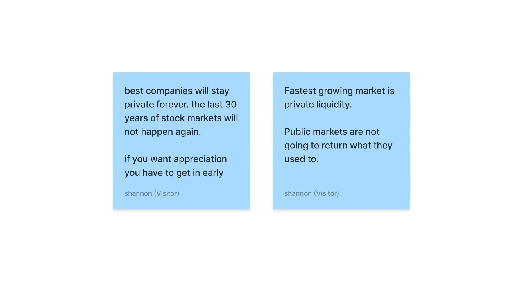
We hosted a kickoff where we gained some insights and really saw how they thought and communicated about Slice. An interesting insight we gained was that private liquidity is the new indicator of the best companies and that getting in early is the way to get appreciation.
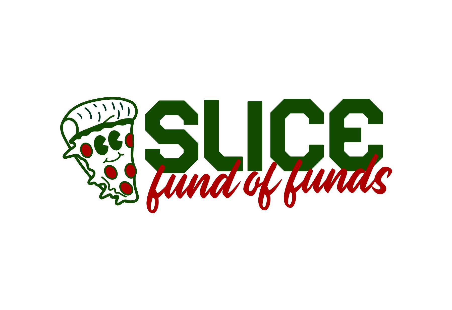
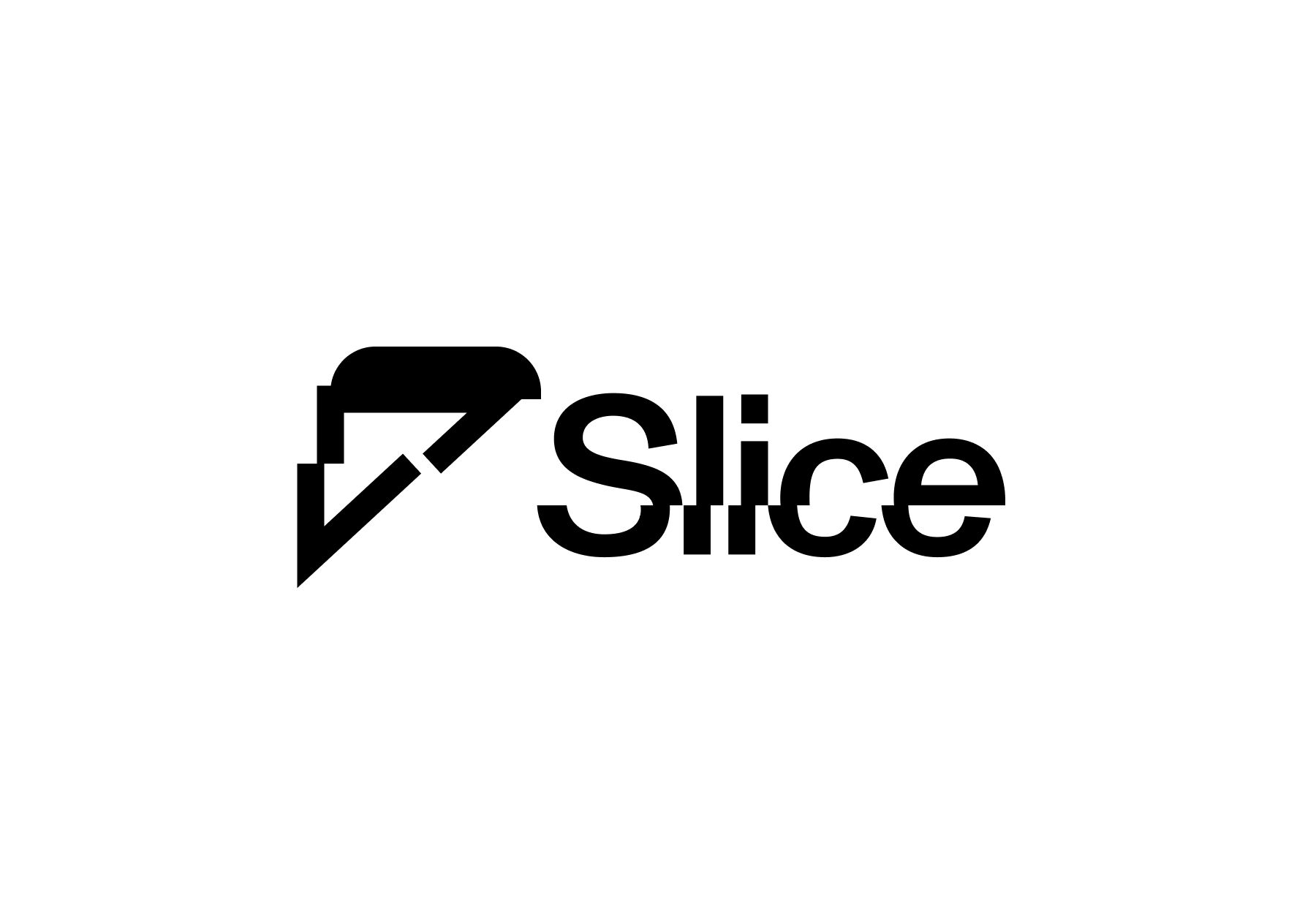
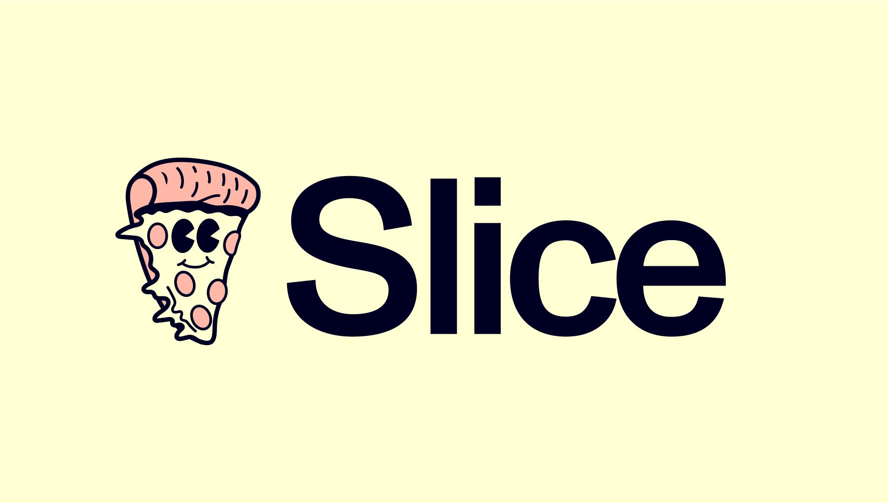
The brand's current identity was simply the name slice, the pizza emoji, and some podcasts they had recorded with players in the space. Simple, and it worked, but they wanted an upgrade. We started with a mood board:
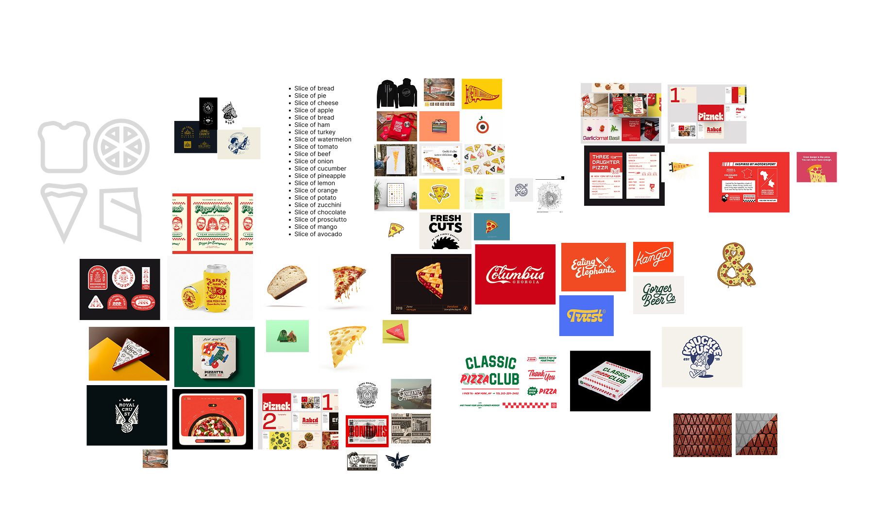
We enjoyed riffing on different types of slices, fawning over script fonts, and pizza! The pizza emoji they were using wasn't for no reason. Fabri is Italian, which meant the pizza could represent the different slices of funds and have a close tie to Fabri simultaneously - we love double meaning.
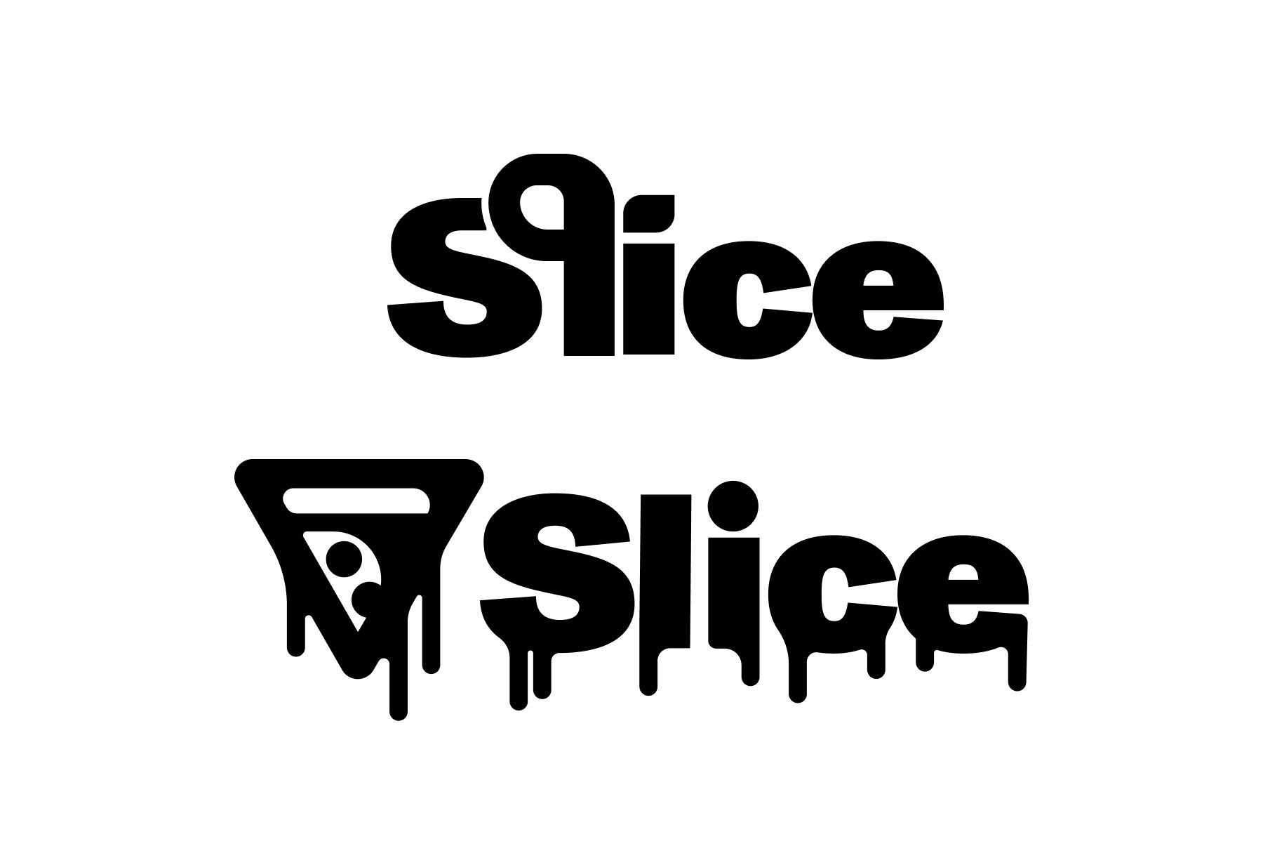
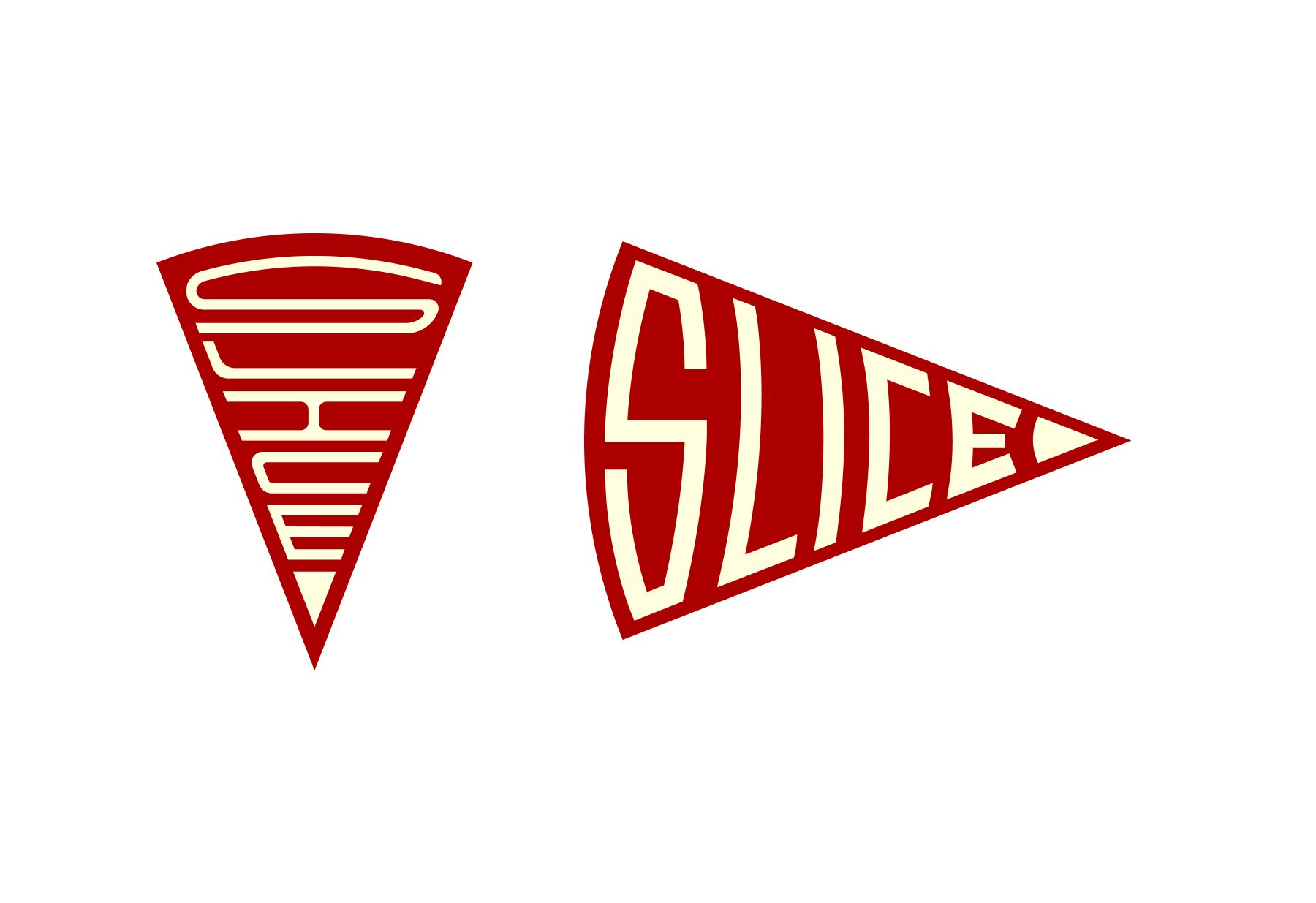
I took a stab at a pizza slice icon to start. Paired with some custom-type treatment, it was interesting but not quite there. The icon is nice but hard to tell any semblance of a story. Pivoting to a pennant design based on some of the initial research, we're able to come up with something interesting there, too, though maybe not as legible as we'd like.
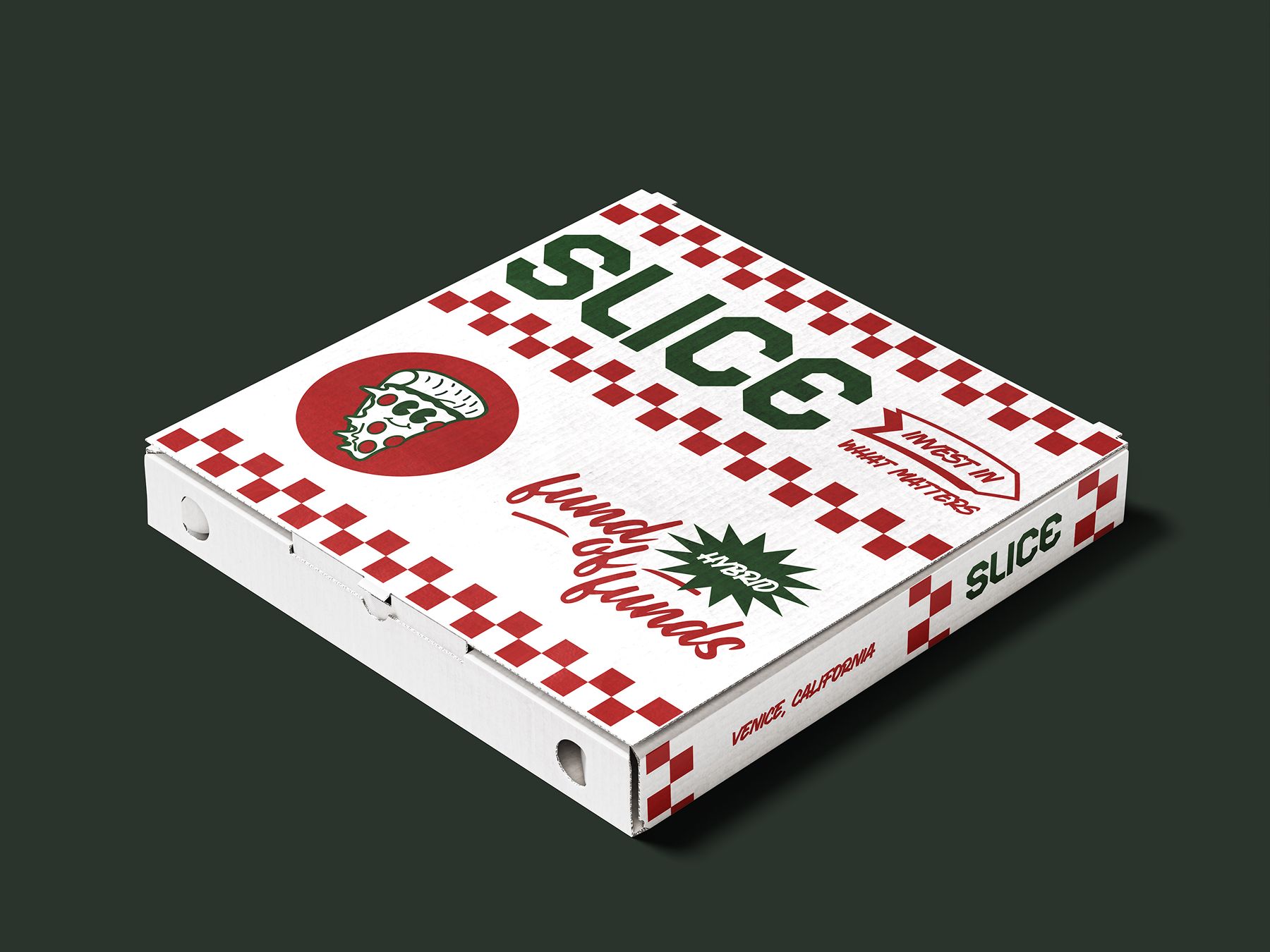
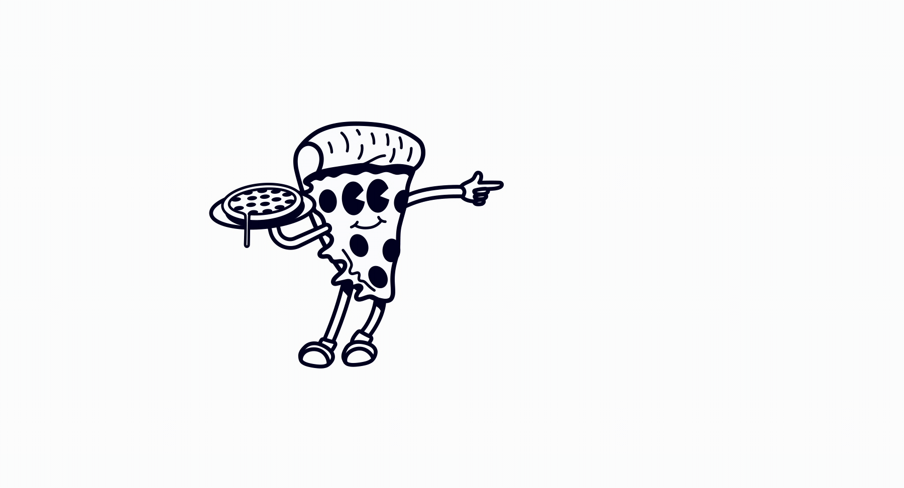
That's when we went to the pizza box. What if Slice had a pizza box? What would that look like? Could we have classic pizza branding for a traditionally serious industry?
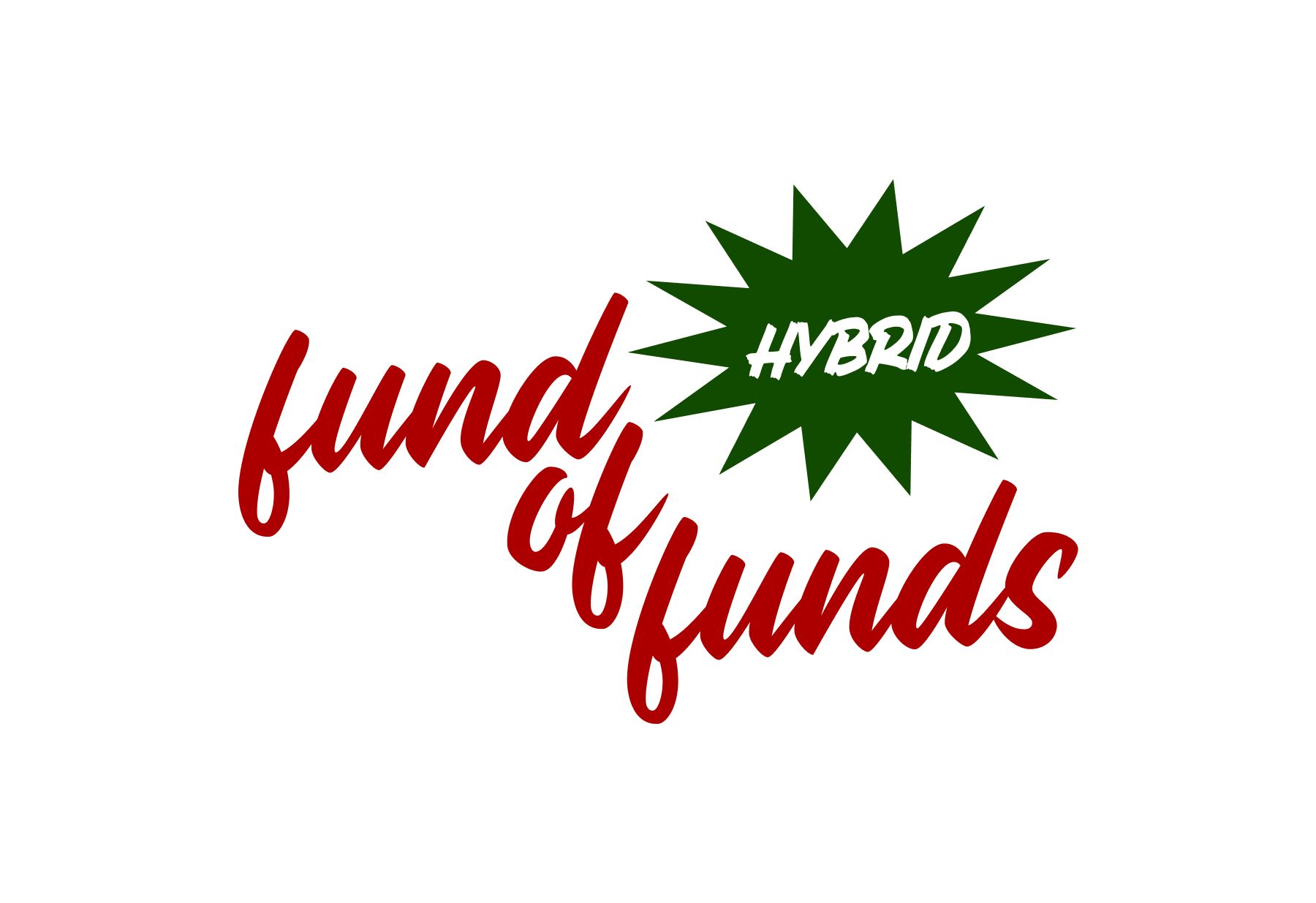
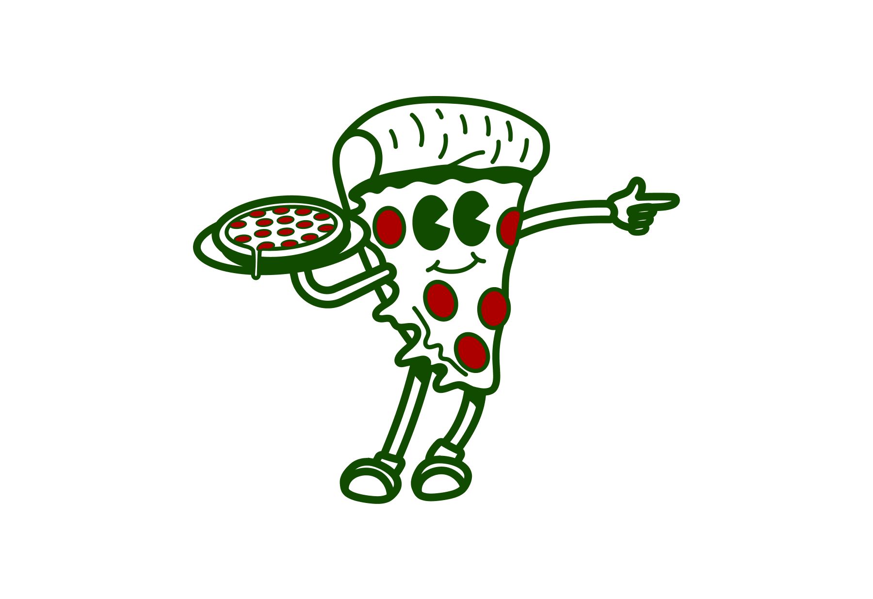
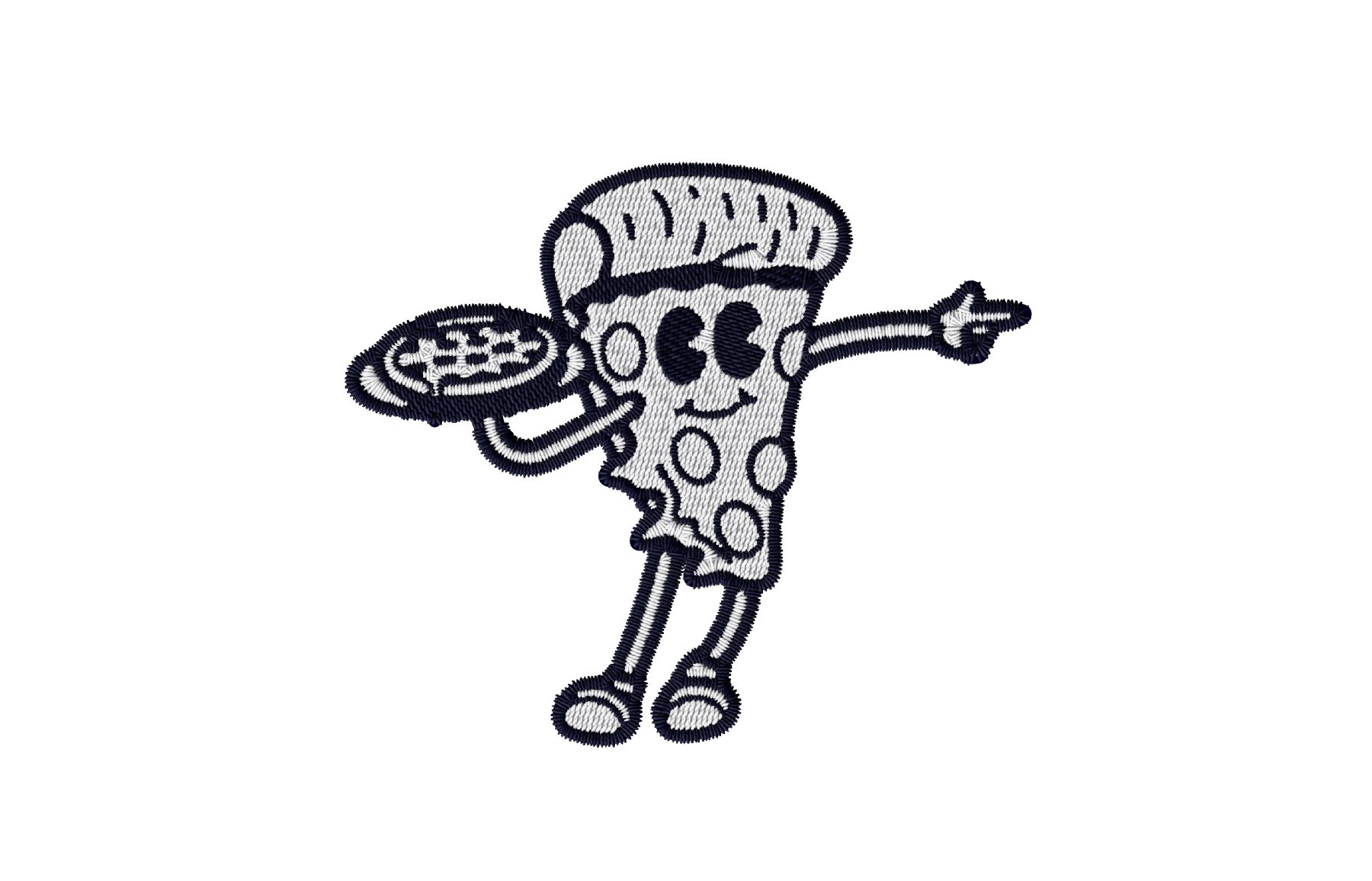
We were able to output some interesting graphics from the pizza box, including Homeslice, the pizza mascot we eventually used later. The 'hybrid fund of funds' in this style was the first time we had communicated any messaging about the brand, and it felt really nice.
Around the same time, I was working through a more literal approach, slicing up the graphics.
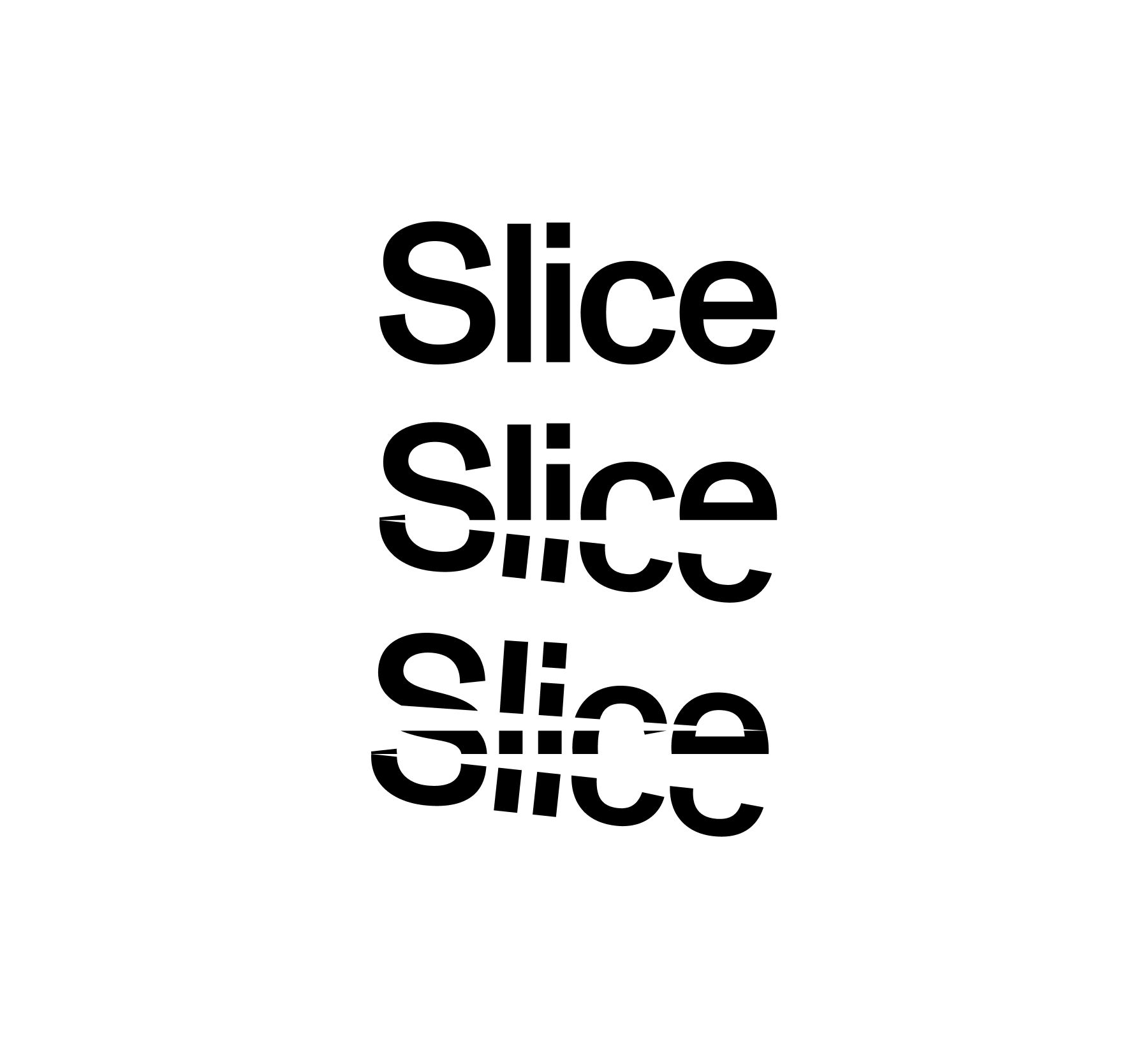

We were able to create this unique sense of randomization and scatter. The infinite possibilities of cutting up word forms and letters into smaller shapes were something we could see as a way to tell a brand story, but we were afraid we had ventured too far into the abstract.
It's best to play it safe as a brand in the investment funding industry and let the money do the talking. Neither of us liked this sentiment nor did we want to play by these rules, but we had to find a balance. How do we keep the brand sophisticated and straightforward enough for the industry players but unique and different enough to prove we are setting a new precedent?
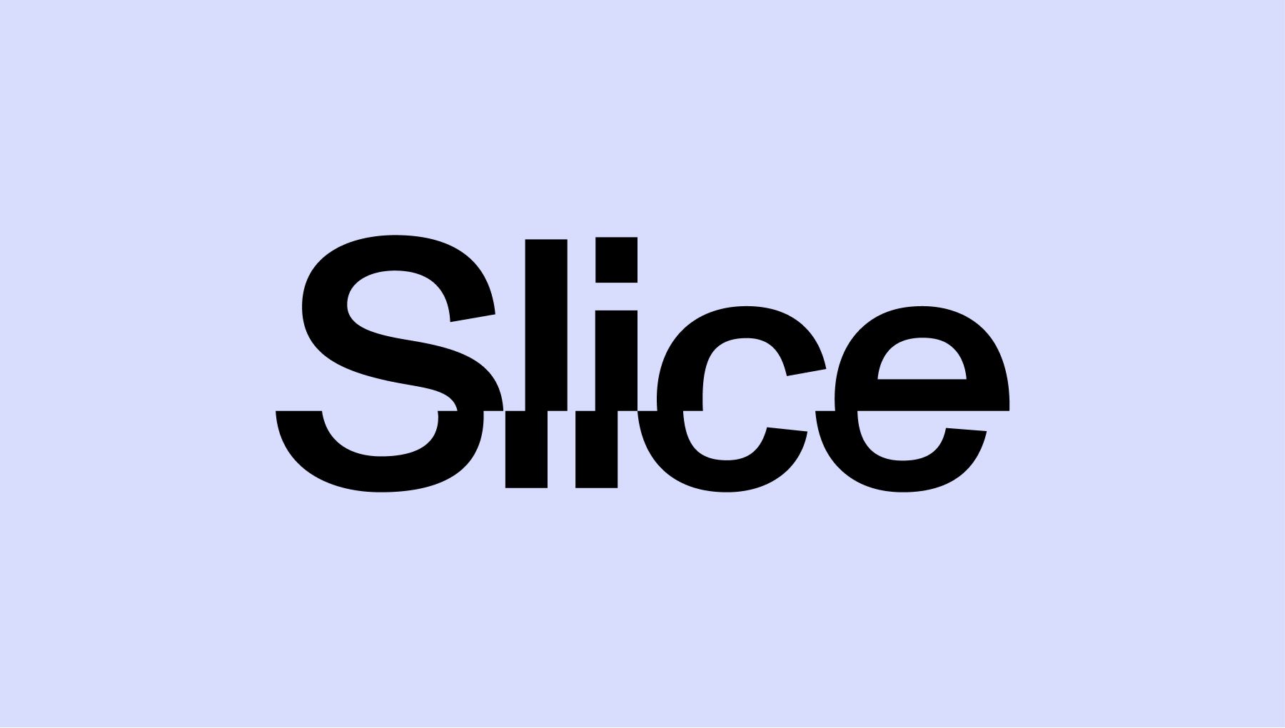
With that in mind we toned down the concepts, including Homeslice's colors.
Around the same time, I jumped back to an initial conversation with Steve during our mood board collection about how we could use different types of slices. That's when I created this citrusy lockup, which fired some cylinders in us mentally, but again, it might have been too graphical.
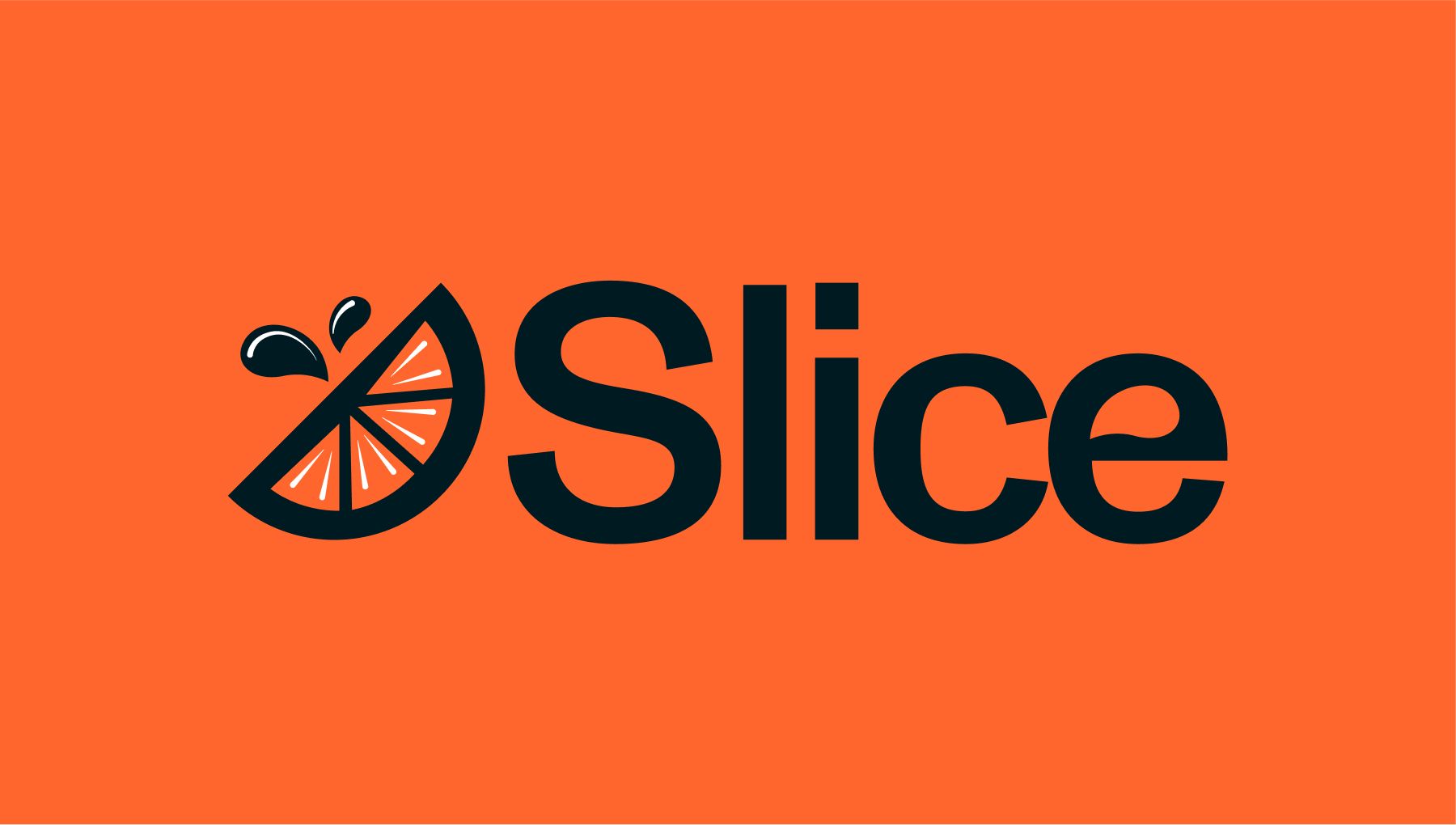
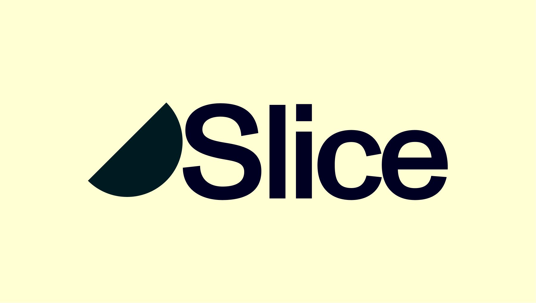
But once we removed the graphic elements and focused on the silhouette of the orange, it became really interesting. The shape is simple enough for the industry but somehow still full of wonder and room to play and tell a story.
Taking it even further, we thought, if this is an orange slice, why can't we have the whole orange? And why can't there be an even smaller slice? Why not all three? Having all three shapes tells the beginning, middle, and end. It's the slices that make up the entire story.

We started to expand on this concept using simple shape silhouettes in marketing site designs. Here, we took riffs on telling the story for the first time.
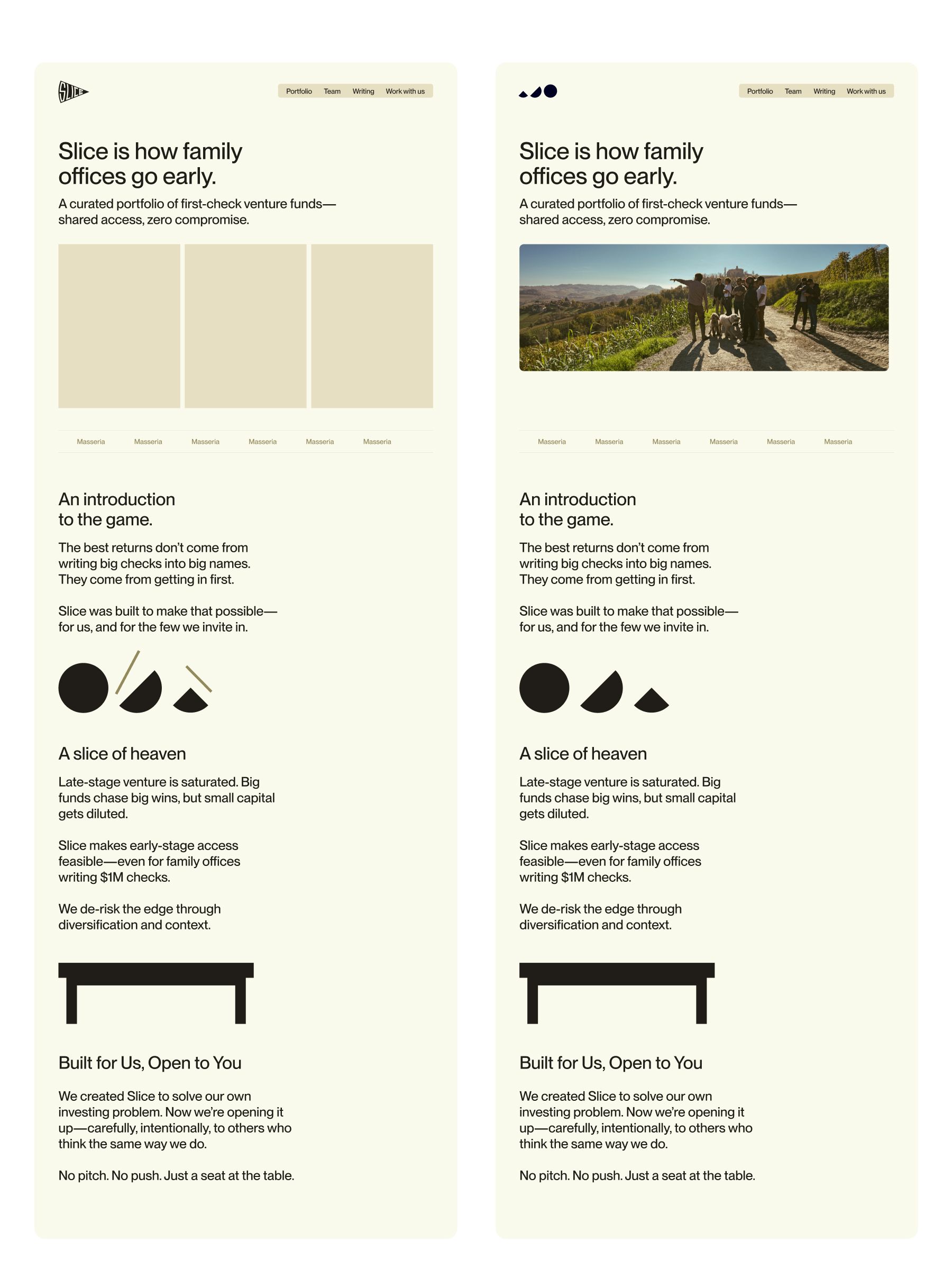
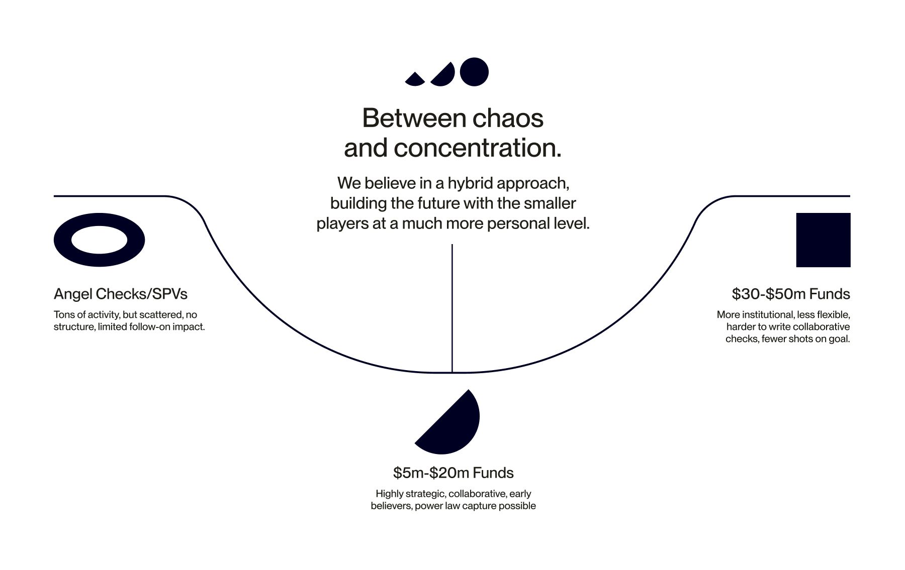

Though not exactly what we wanted, it made it clear that this shape would work to drive stories further out. We liked how it looked with cropped photos and as illustrations in diagrams; now, it was time to see it move.

Through animation and other applications, the brand felt nearly complete. But practically, what could we create right now? The podcast they had started was now the brand's first real test. We created a simple homepage and podcast index that we thought brought the appropriate amount of attention to each podcast episode. The brand was now living and breathing in the real world.
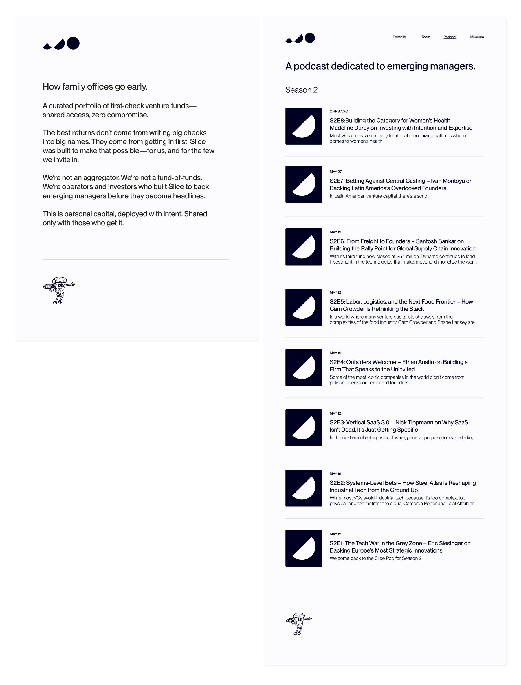
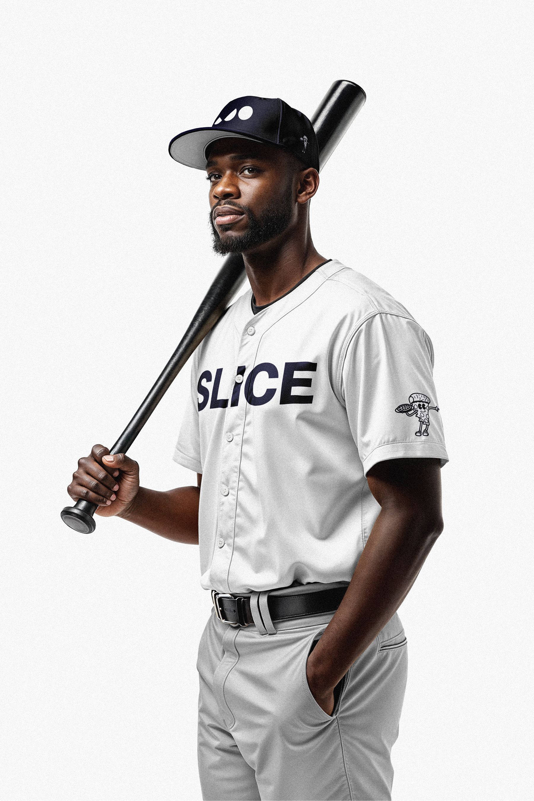
We finalized the exact logo and solidified brand elements through mockups. A hat, baseball kit, and embroidery patch of Homeslice rounded out the identity and made it feel complete.
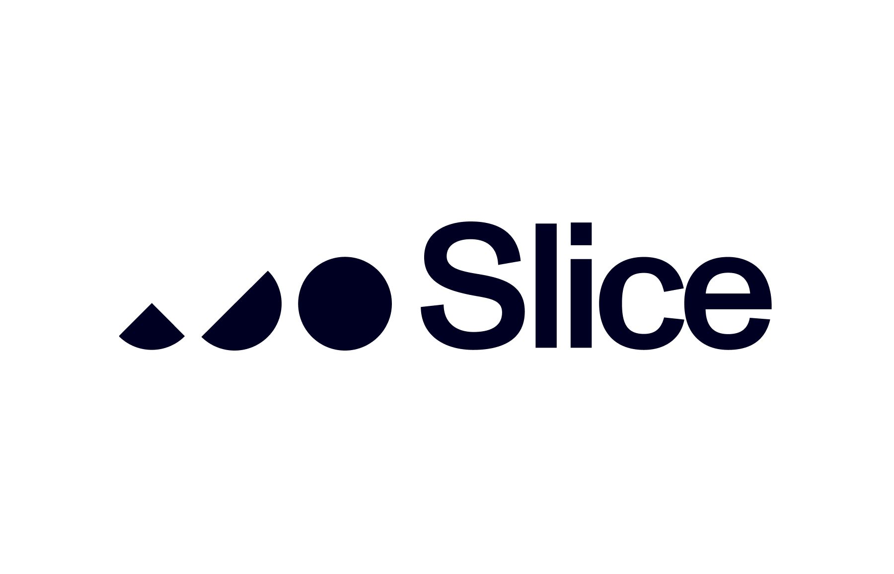

Walking the fine line between fun and modern while appealing to a reserved crowd is possibly the hardest trick in design. It's about focusing on the simple—simple enough to sell to anyone, unique enough to stand out—and the line is constantly moving. With Slice, we're able to find a mark that, on the surface, is simple but reveals depth and meaning the more it's applied.
Delve into the creative processes that drive successful branding and artistic endeavors.