Elegant Icons for the Theater.
Iconography that emphasizes the elegance of live experiences.
Published Mar 15, 2025
Author Austin Barto
Full Icon Set
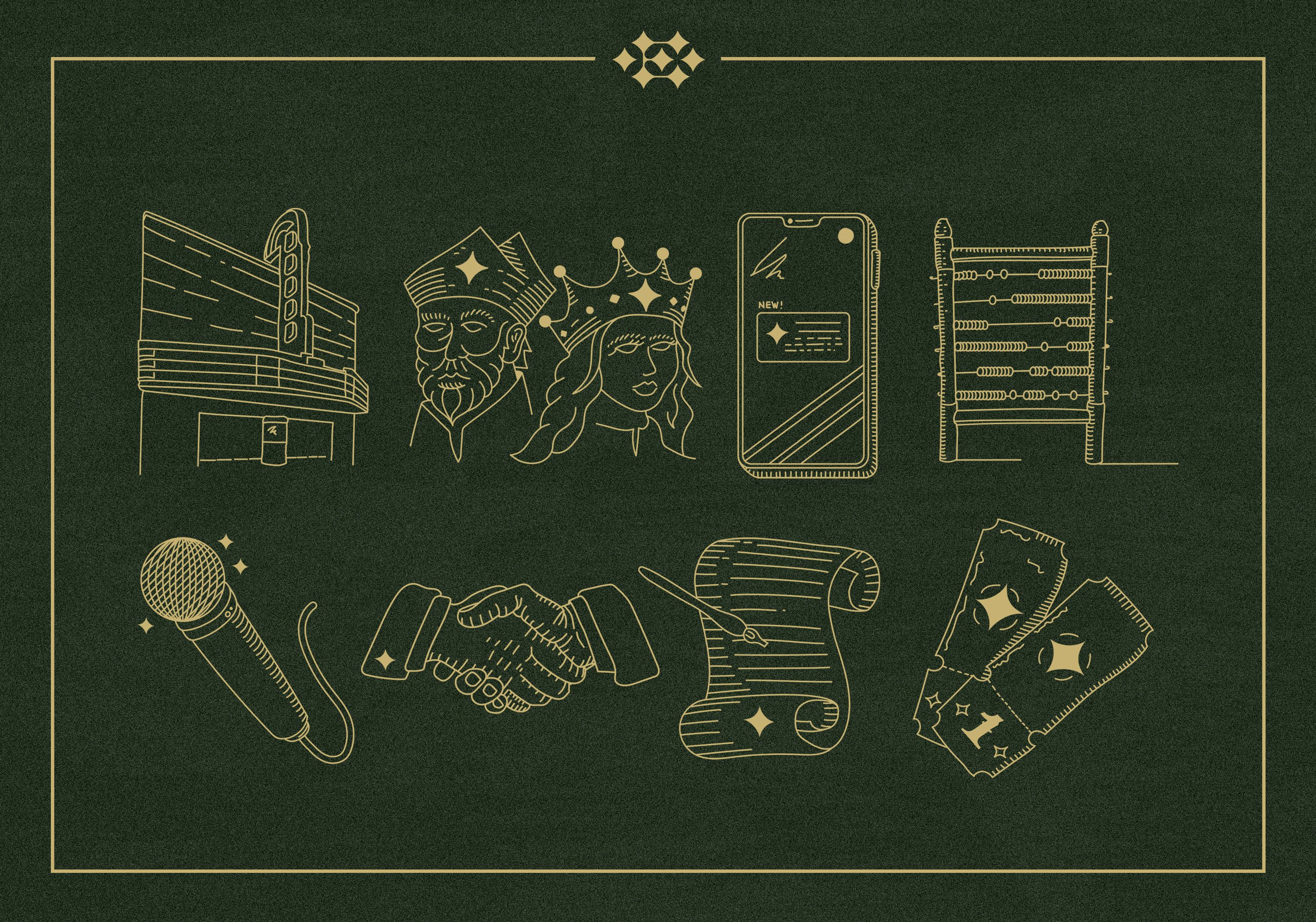
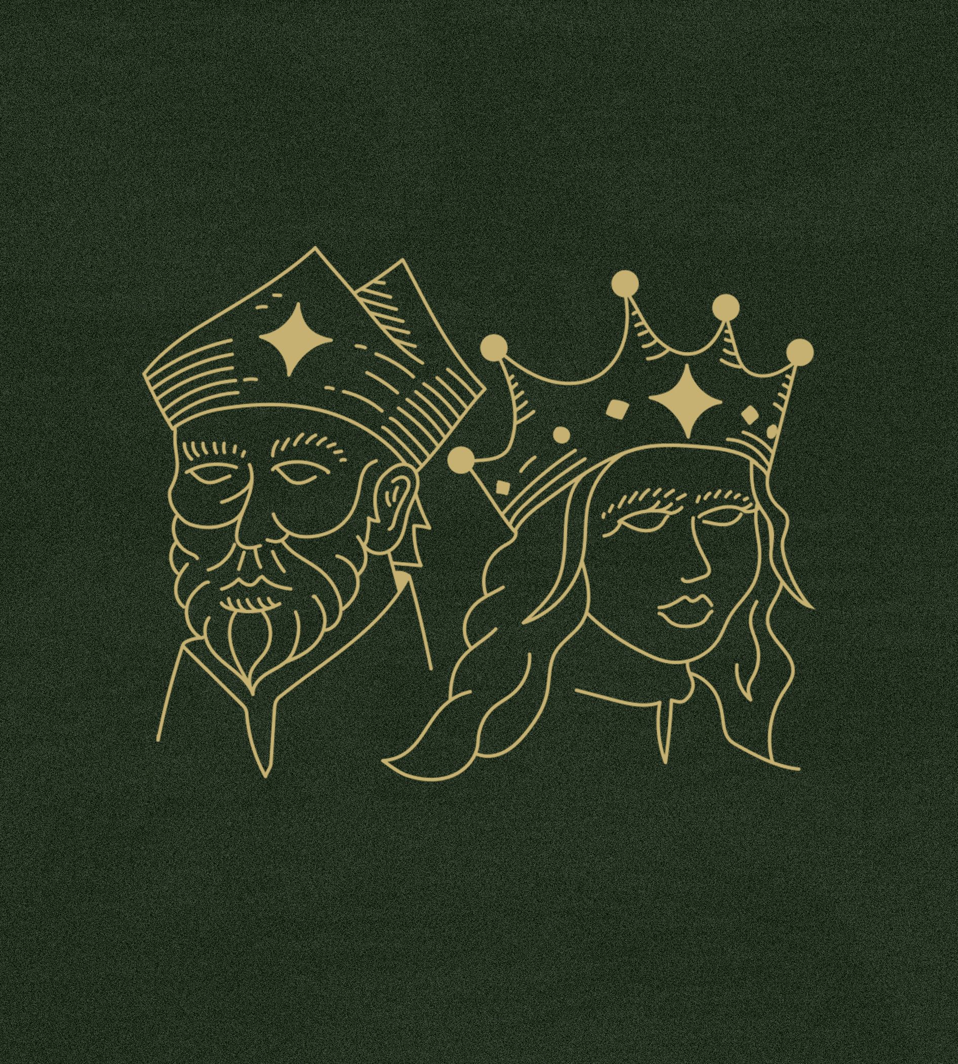
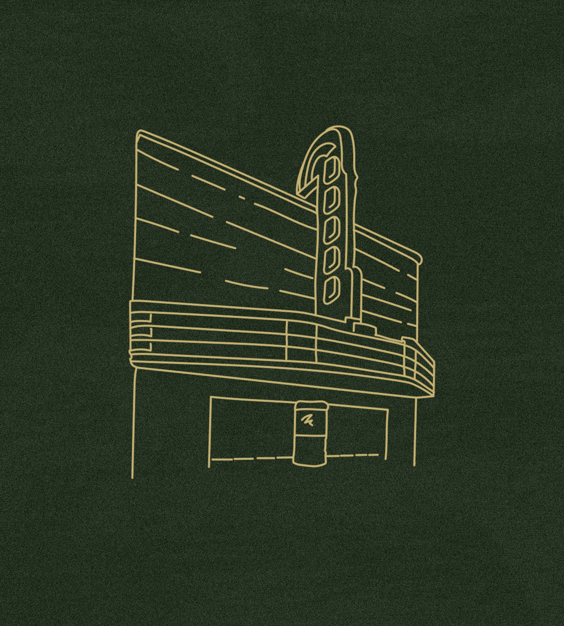
TM recently had the chance to rebrand and rename Encore Pro, a live event marketing and operations platform. With elegant, luscious green and gold colors representing the brand and an equally sophisticated mark, Encore Pro now had a luxurious identity to sink its teeth into.
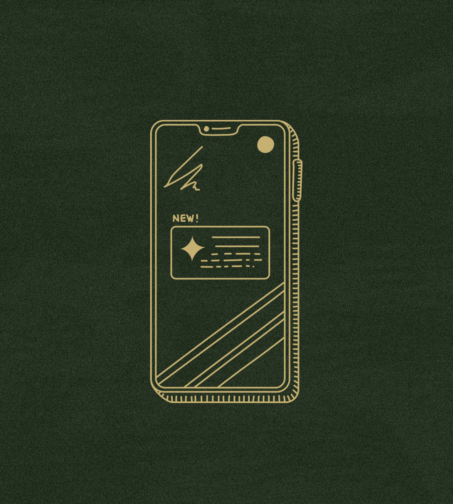
Rather than defaulting to generic symbols, we crafted custom icons that feel considered and modern — reinforcing Encore’s brand as one that treats every interaction with care and intention. Each icon adds visual texture and a subtle narrative layer, helping users feel engaged with something special — because they are.
Often, software can feel cold or transactional. This level of design detail creates a human connection, especially with our hand-drawn etching technique and imperfect lines. It shows that the brand’s identity extends beyond the logo and into every nook and cranny of the experience.
Because prestige isn’t just about how a brand looks; it’s about how it feels.
Audience Segmentation

Data-driven Insights

Contract Management

Team Collaboration

Customer Engagement

Resource Management
Centralized Venue Operations
Onsite Experience
In the context of categorizing content, the Animation tag has been replaced with the Art tag. The Brand tag remains unchanged to ensure accurate content classification.