Branding Power
Giving identity to a company that aims to transform how we transact with energy.
Published Jun 5, 2025
Author Austin Barto
Thought Merchants recently had the chance to give life to a new brand that’s never seen the light of day, just a name and an idea - Static Finance. Static aimed to revolutionize the power trading industry by merging it with blockchain technology, and they wanted us to give their concept a visual identity.
To start this project, we hosted the Static Finance team for our kickoff workshop, which was a good way to get to know the brand’s identity and the people behind it.

There, we learned the ins and outs of static finance. Who were their competitors, who were they jealous of, and what kept them up at night? Checking all those boxes you check to get to know someone on the surface:
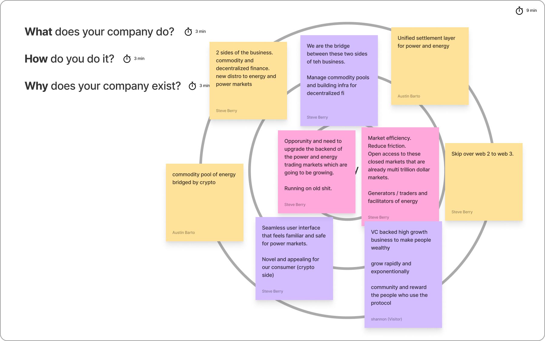
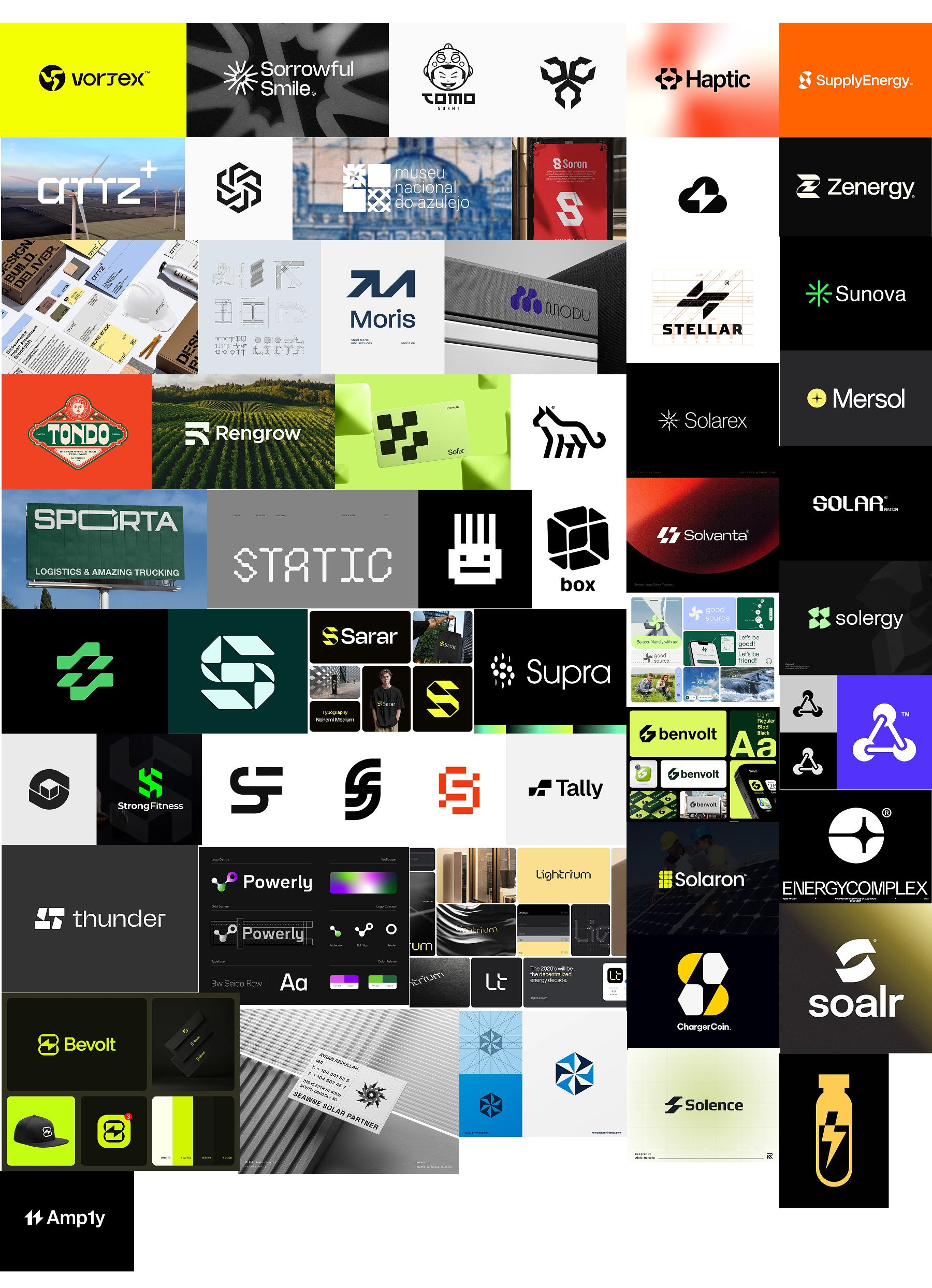
We also shared with them some of the inspiration we gathered before we met:
From there, our journey was off! We started out the gate with some strong marks. The obvious angle was the lightning bolt, but we also found some success imitating electrical towers.
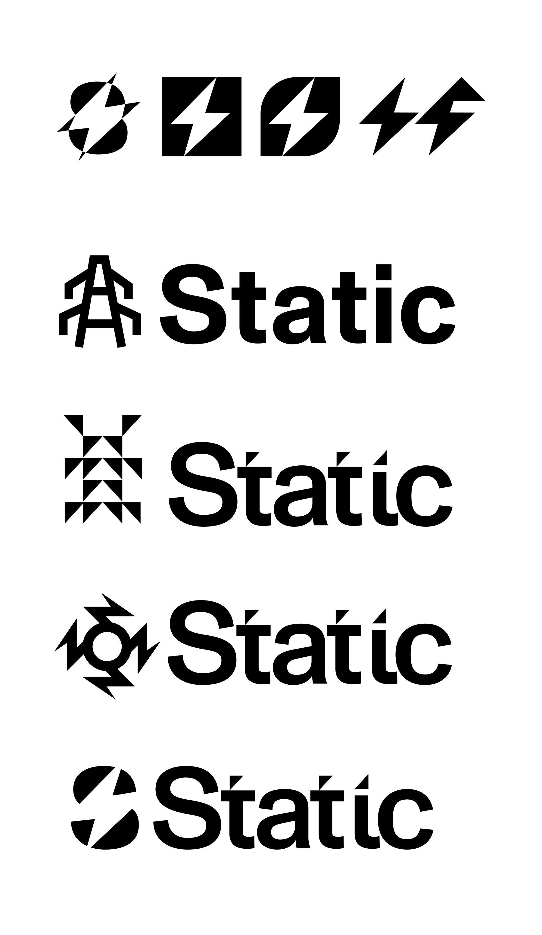
As we made these marks, it stuck in the back of our heads that they wanted their stable-coin name to be Power. “Buy Power” is a layered marketing message that stood out to us during the kickoff as a story we could get behind.
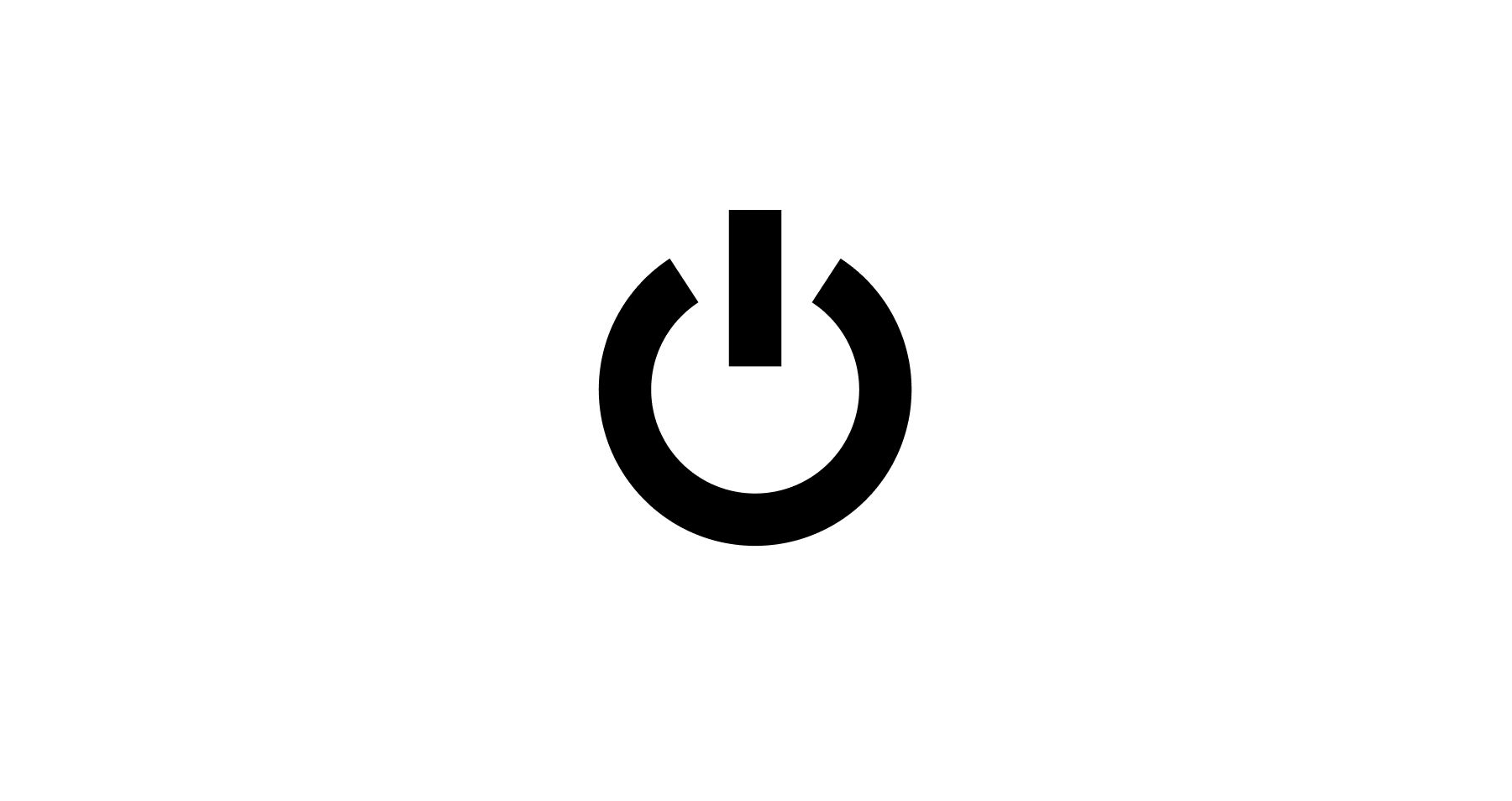
That’s when the power icon popped into my head. A universally known symbol that meant exactly what our coin would be? How could I not at least try it on...
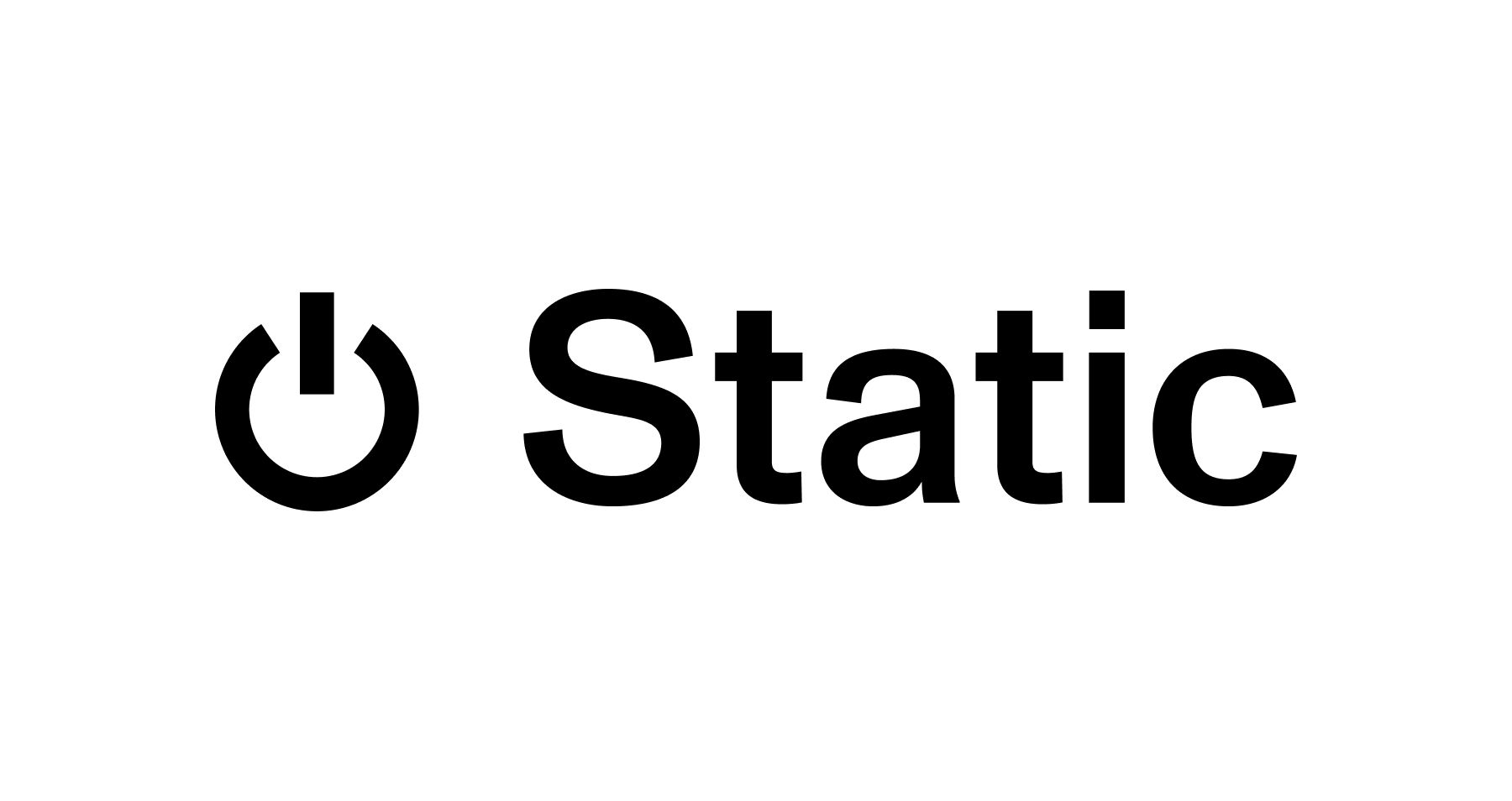
While the mark itself has nice weight and balance, the meaning felt convoluted and backward. Visually, it felt similar to shining the bat signal in the sky, and Superman came to help. Static with the power symbol, something just wasn’t clicking.
And the more we thought about it, the name Static wasn’t anywhere near as strong of a name as Power when it came down to the literal meanings.
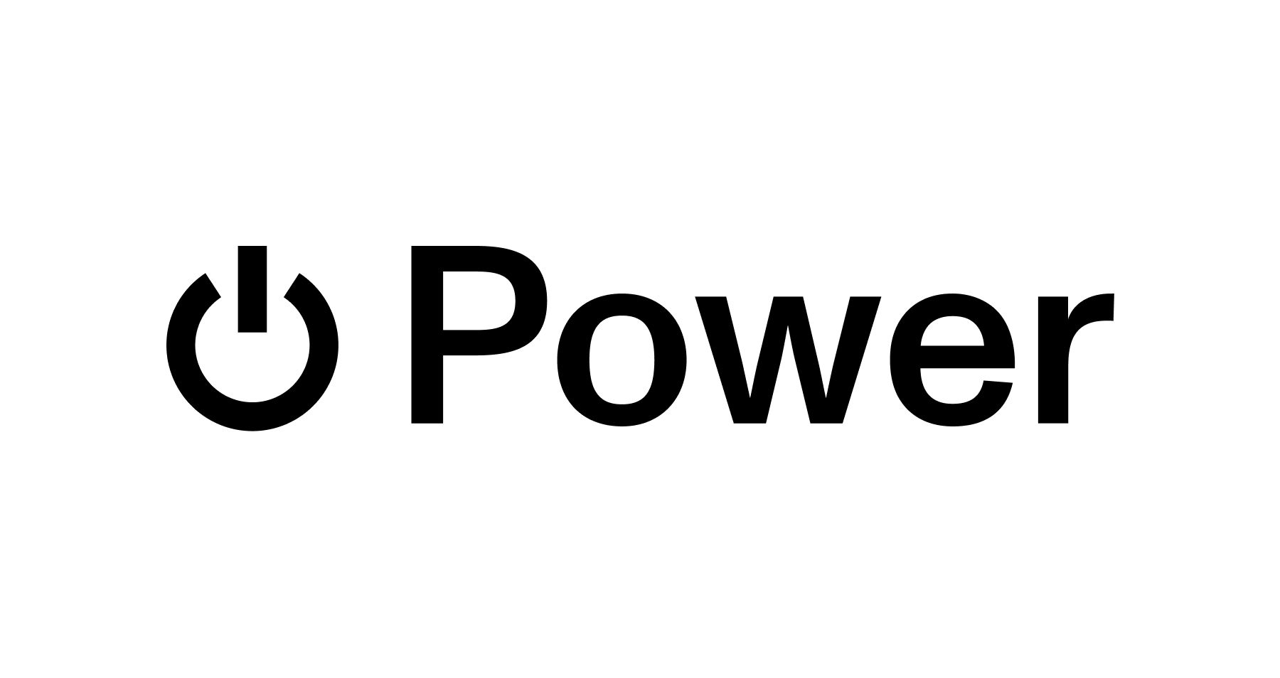
We then doubled down on the name Power. It had more room for play and wasn’t as static. Here, we explored different variations of the icon and power iconography, with nothing hitting quite like the original icon.
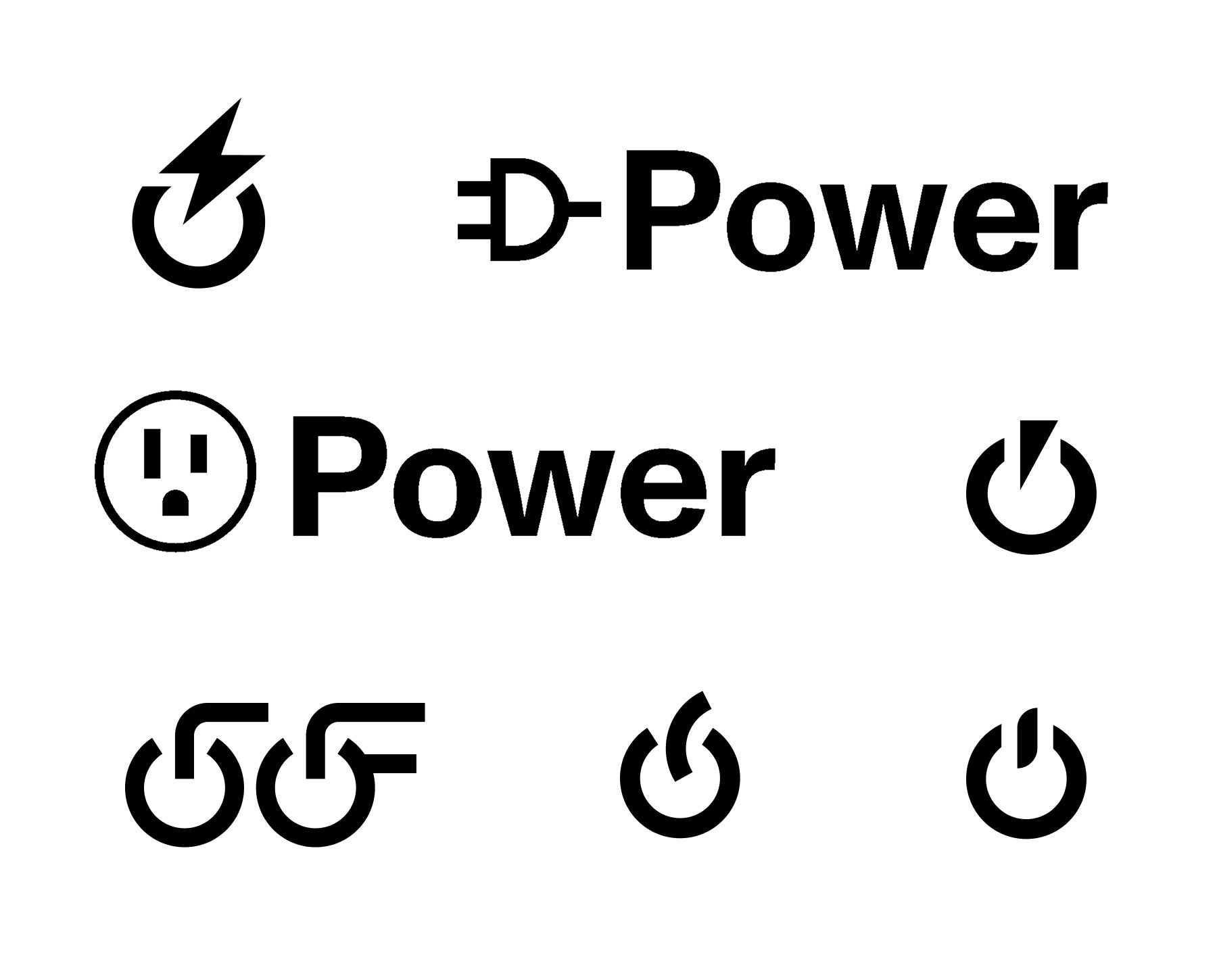
It felt surreal that this could be a possibility. Never mind the crypto world, we had trouble finding anyone who had ever used this icon with a brand.
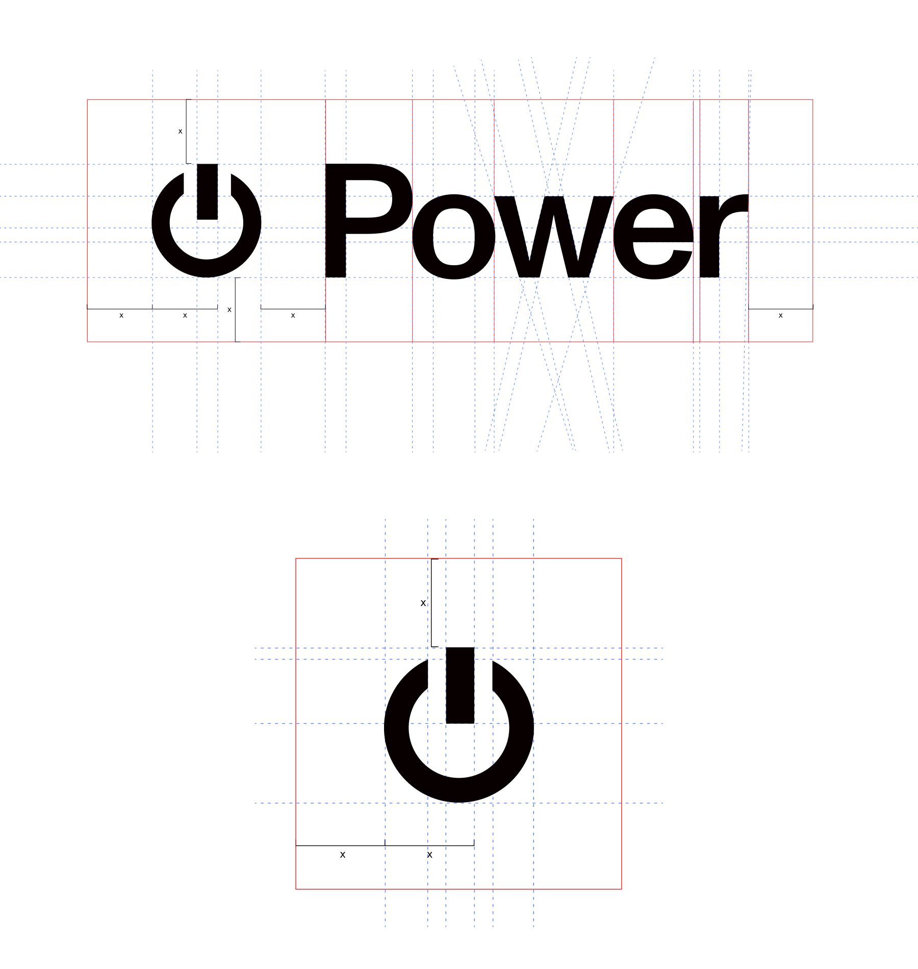
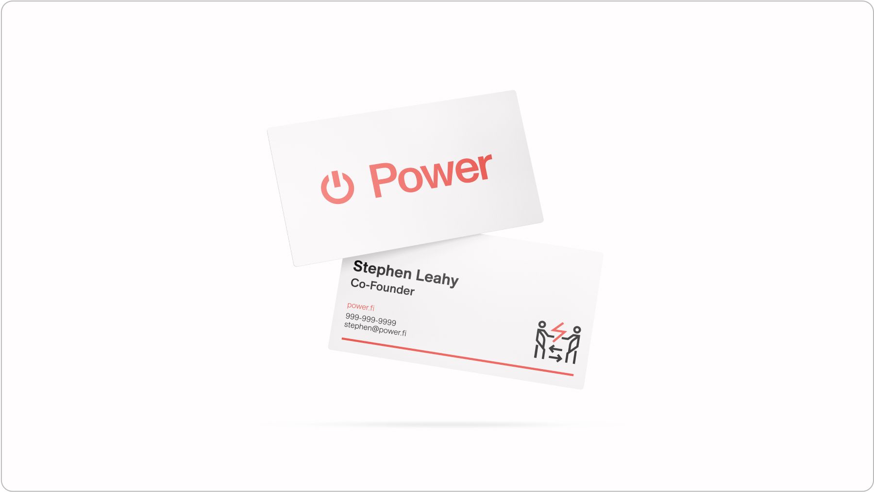
We created nice lockups of the mark and logo. As stories were brewing about what Power could be, it was time to try on some color and messaging.
In the kickoff, we floated yellows and blues and all the different ideas we felt privy to. The brand story was strong enough that it felt as if we could go any direction, and that’s sort of what happened.
When I started to design the first real assets, I used orange—just what I was feeling at the time, the energy, if you will. Everyone seemed to like it, too, but I still wanted to be sure.
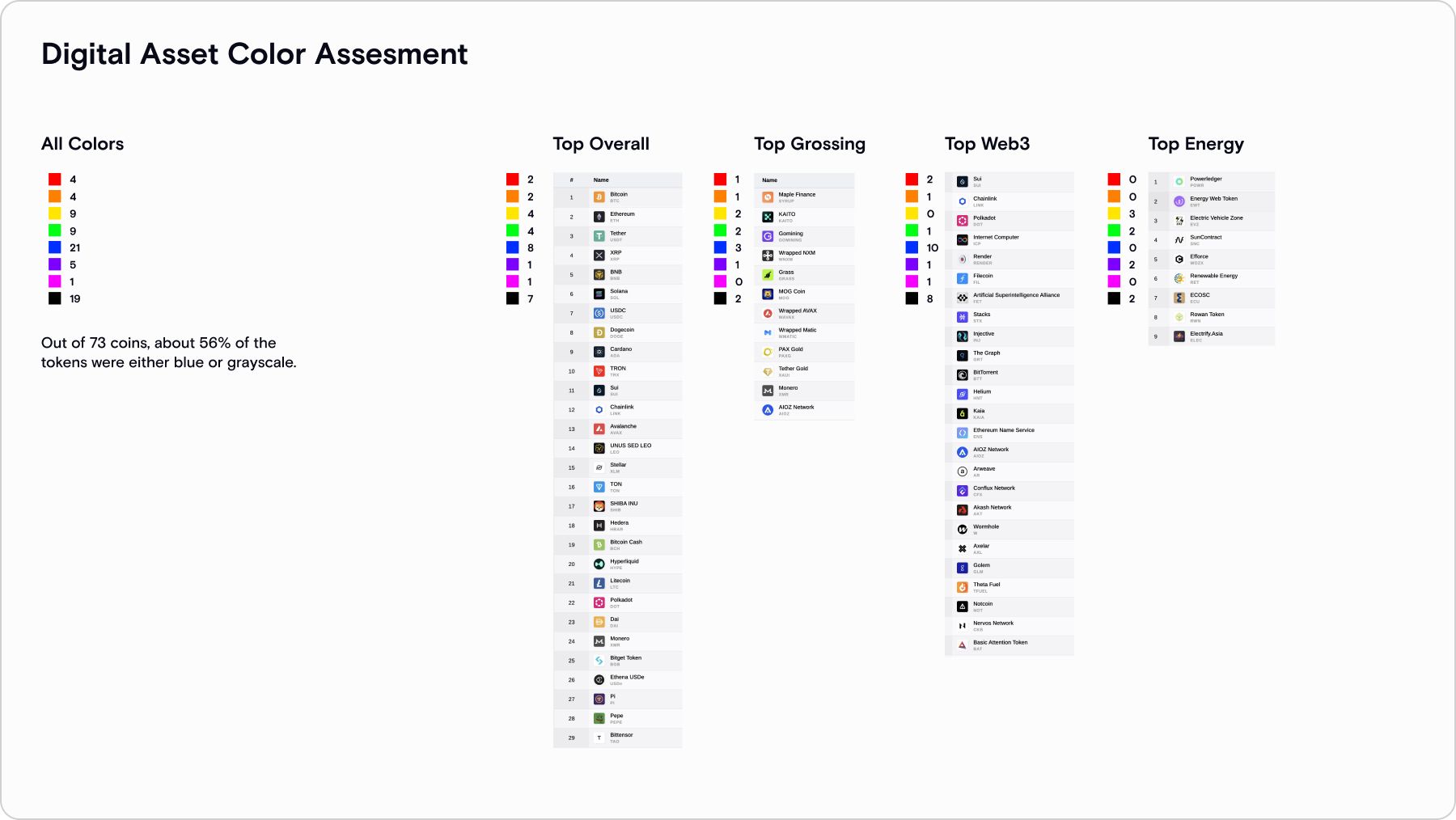
Looking at the crypto space and screenshotting the token logos of top brands, I found a pretty interesting insight into the industry—everything is black and blue! It was clear that orange would suffice enough to stand out, and our liking was justified. But which orange would we use specifically?
During our research on oranges, we gravitated towards this muted tangerine poster series that was well done with nice grid work and typography. Around the same time, throughout the brand process, Steve and I floated around electrical diagrams and referencing those for design fodder.
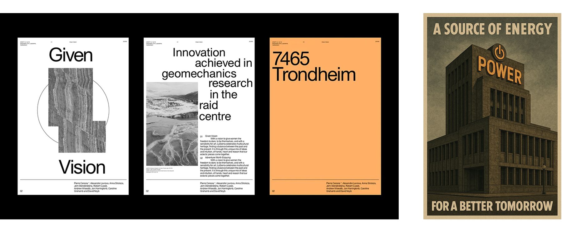
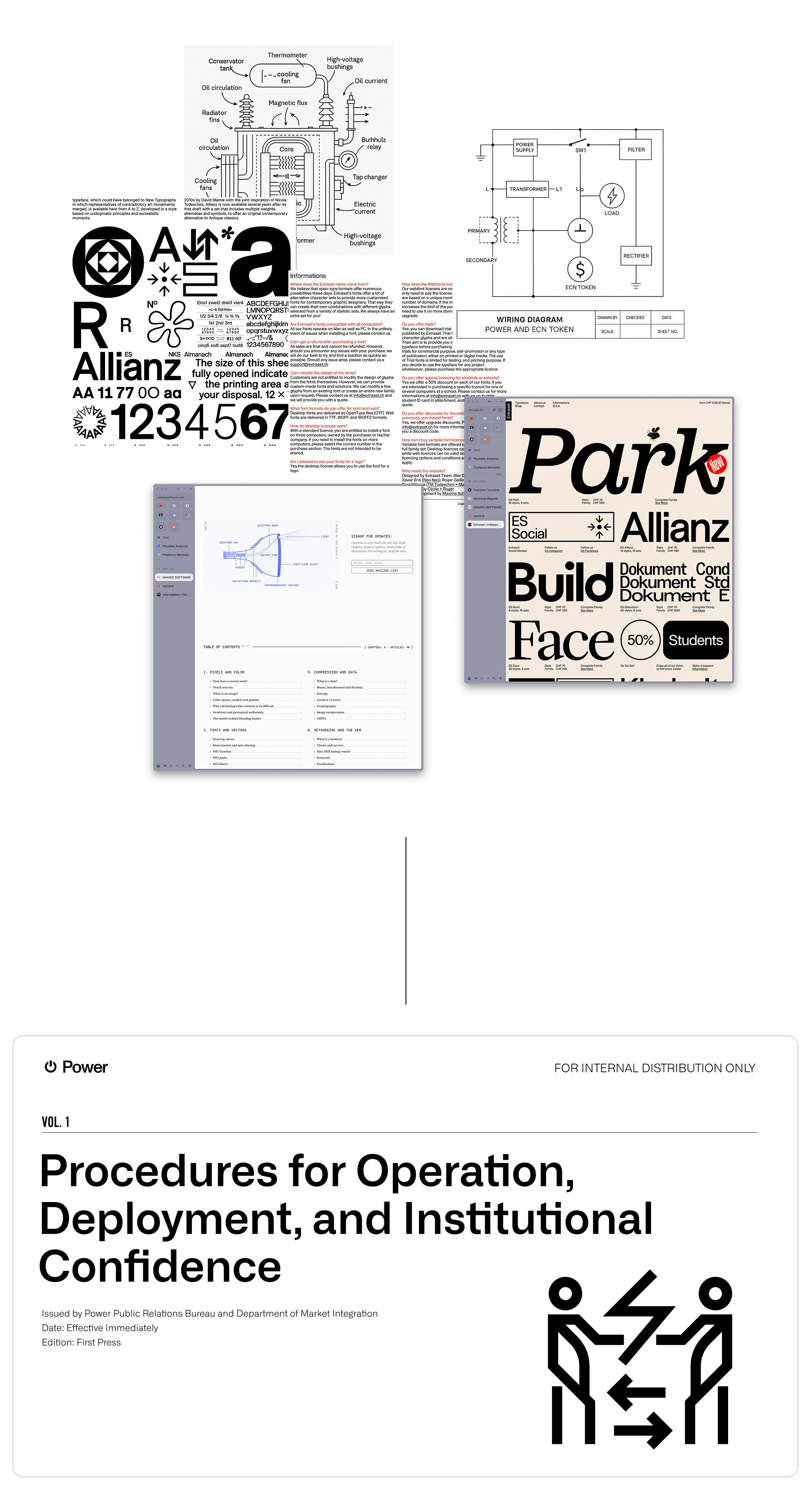
The direction became obvious—public utility as a brand. Technical diagrams, instruction manuals, etc., aren’t designed with fluff, but they are nothing short of cool. We leaned into that idea with some more color exploration.
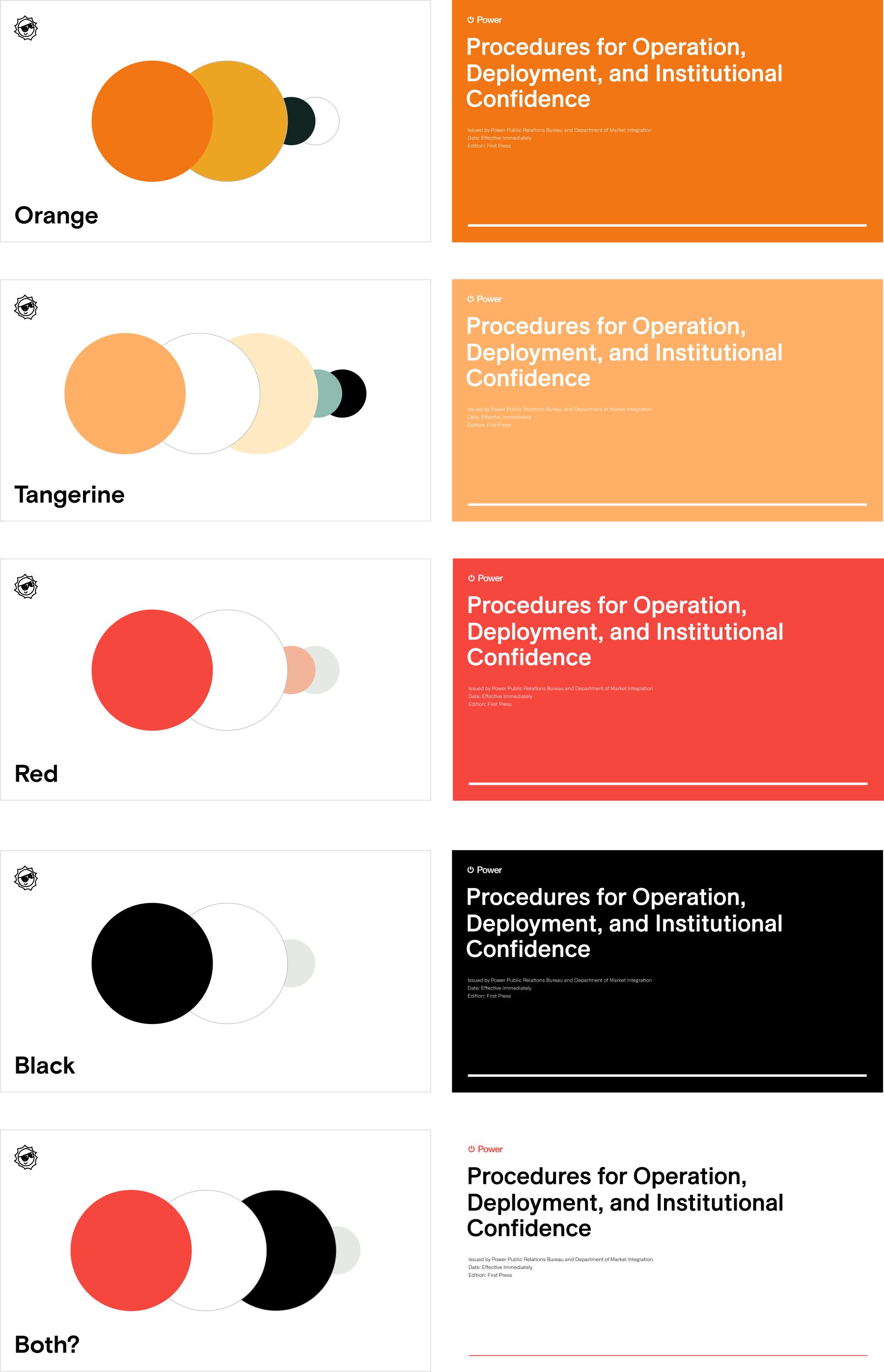
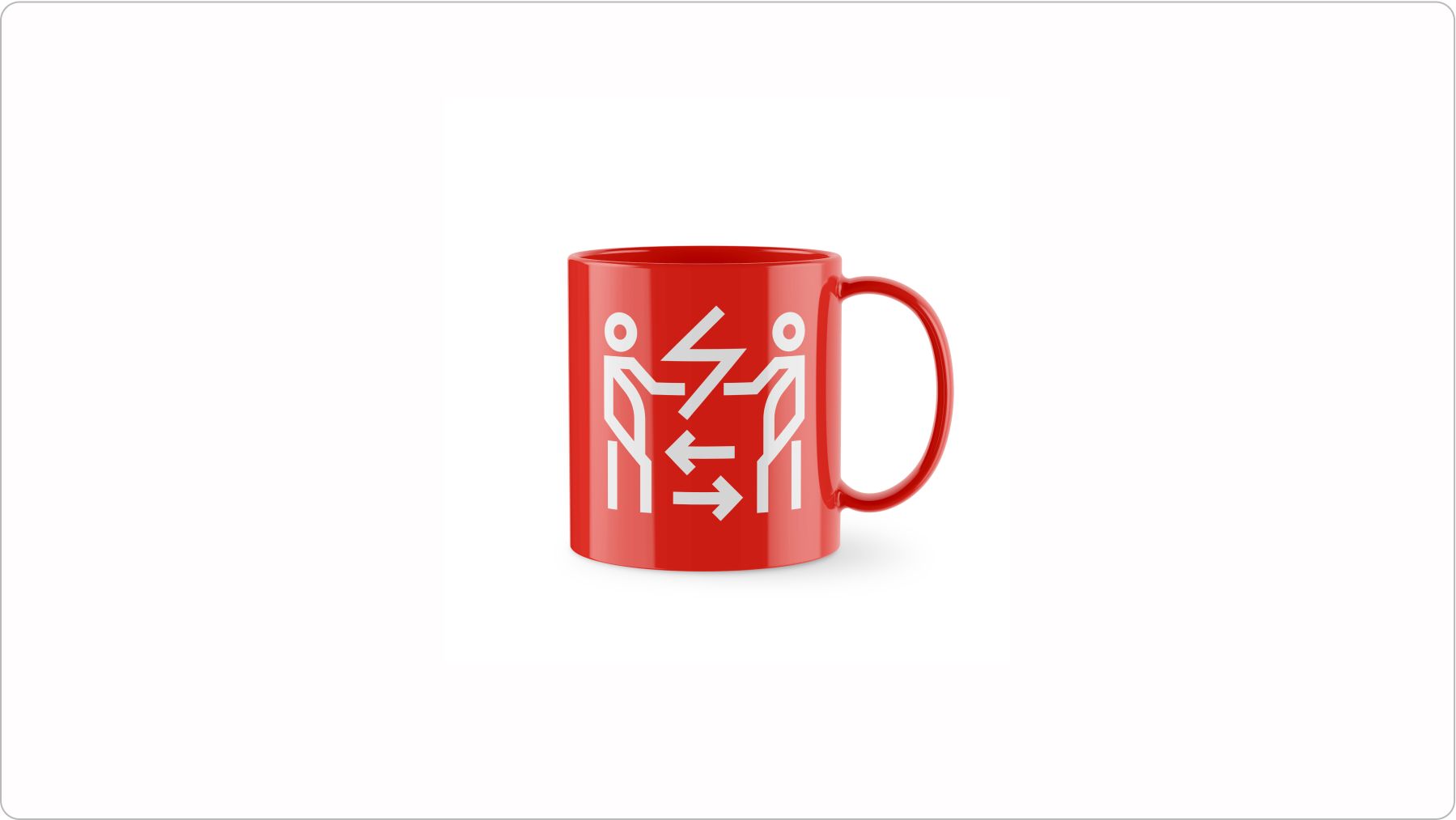
The utility wanted to be black and white when it came down to it. So, we treated it as such. The pop of red became an accent, and the idea was to keep it simple - don’t overwhelm the viewer with the color but introduce it subtly.
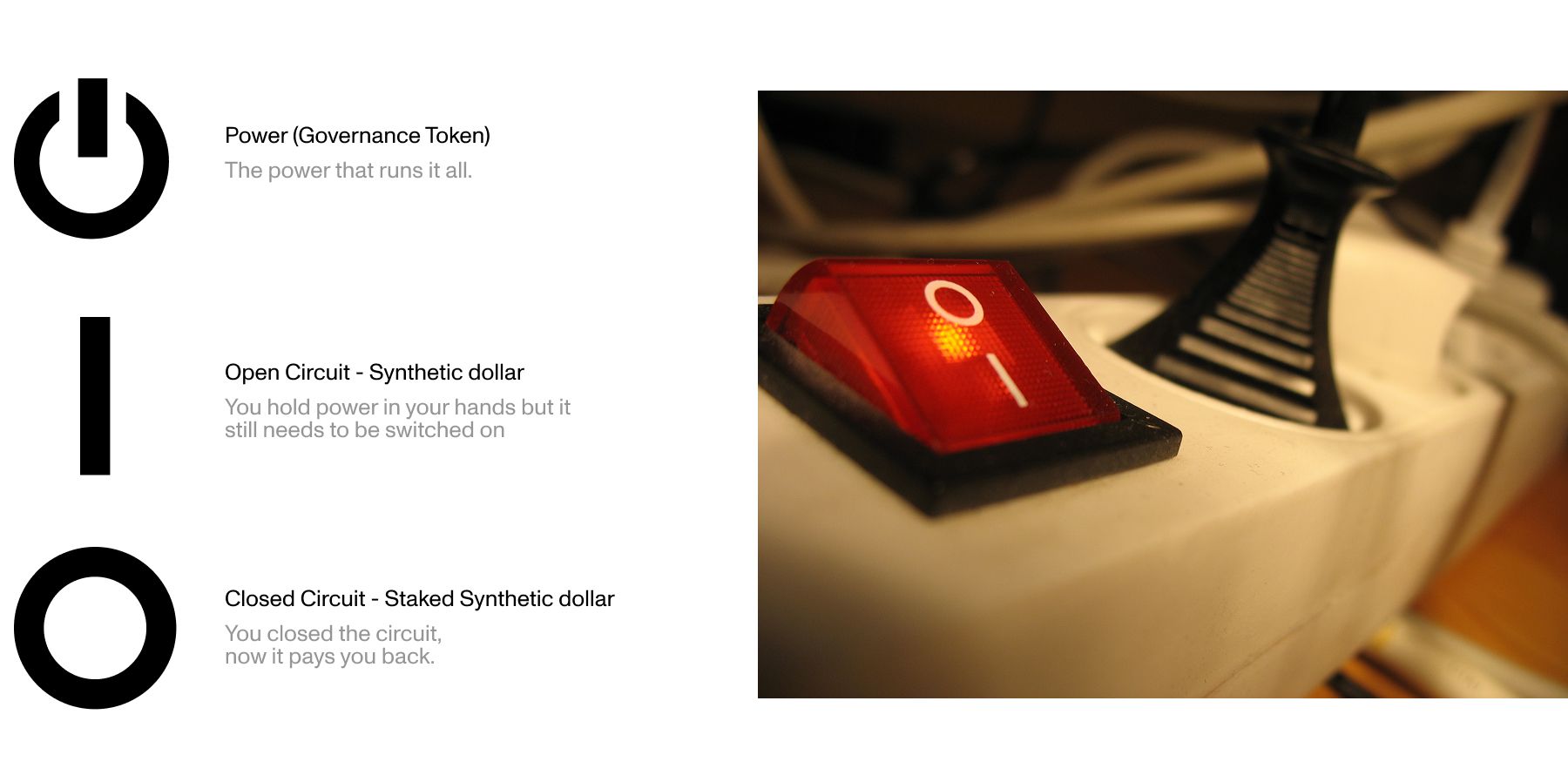
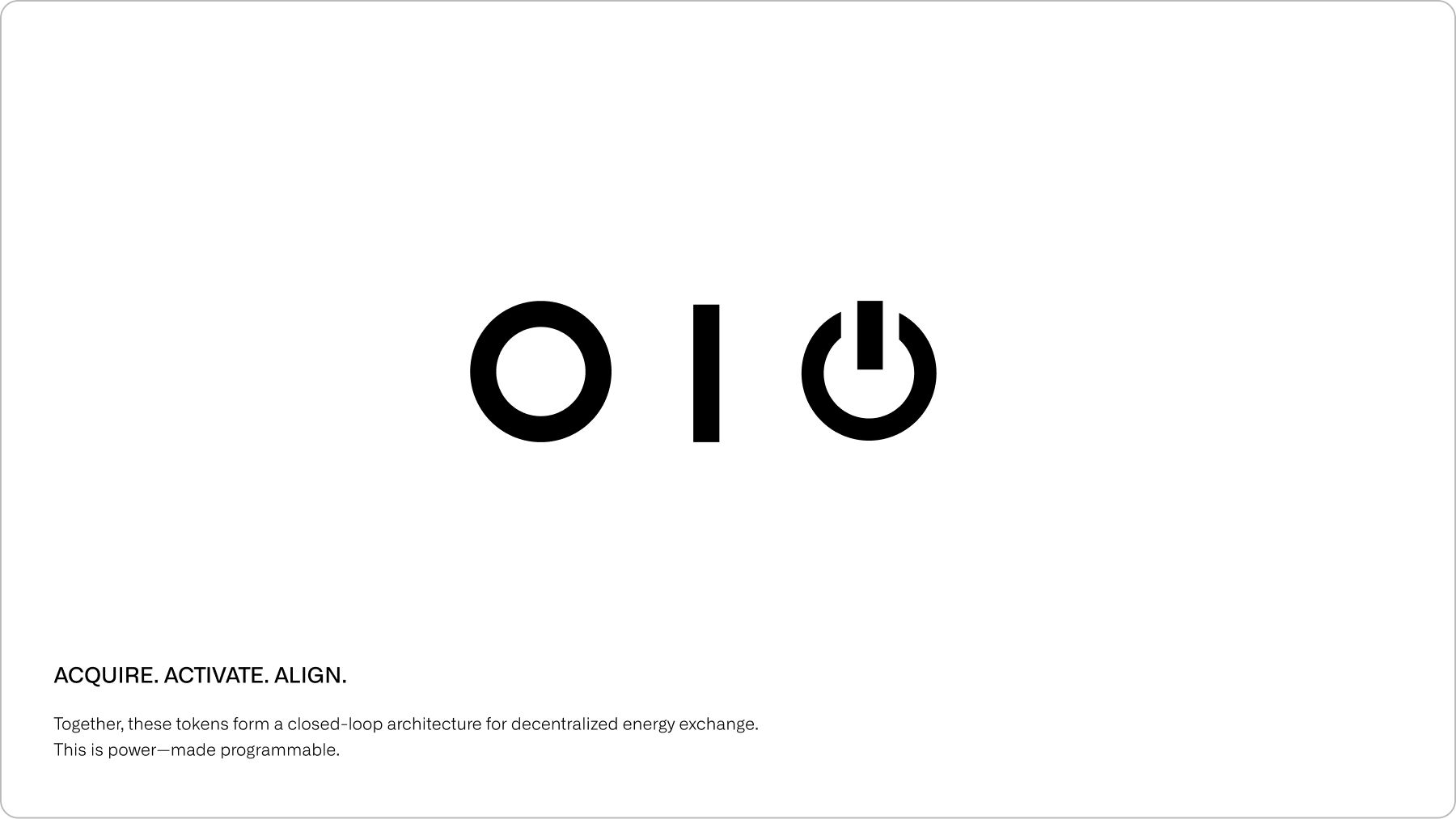
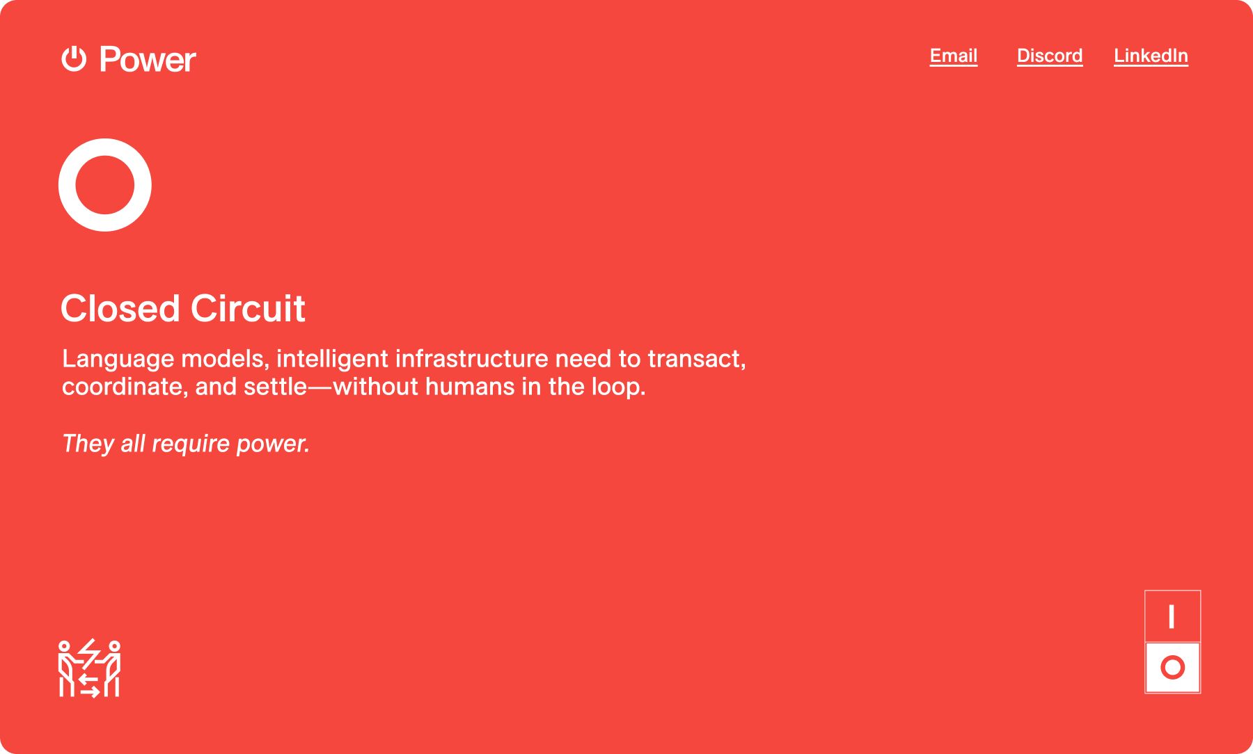
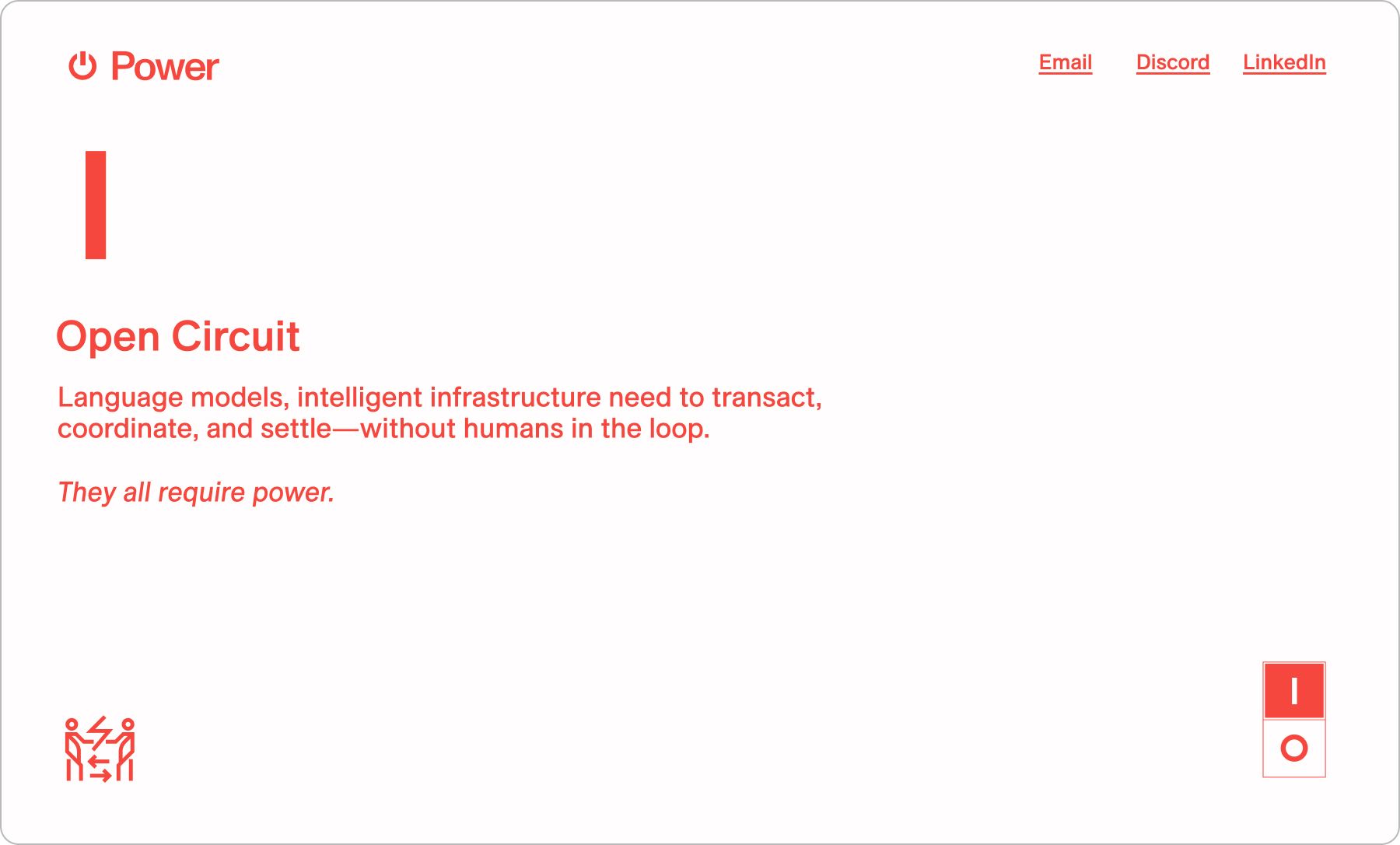
With colors and the brand logo mark set in place, we still had to decide on the two supporting tokens. The way this protocol runs, there’s a stablecoin, a staked coin, and a governance coin. We knew the government coin (or movement coin, as we’re calling it) was going to be $PWR and have the illustrious power icon as the token symbol.
Taking a deeper dive into the power symbol, we remember the on and off switch found on power strips. Instead of using one symbol, they often use two, and these on/off symbols are universally known icons, too. The circle ‘O’ indicates off, and the line ‘|’ indicates on. It’s so simple you can type it out on a keyboard.
But if we use it as a metaphor to tie the tokens together, the open circuit as the stablecoin, the closed circuit as the staked coin - the story seems like it can’t be anything else.
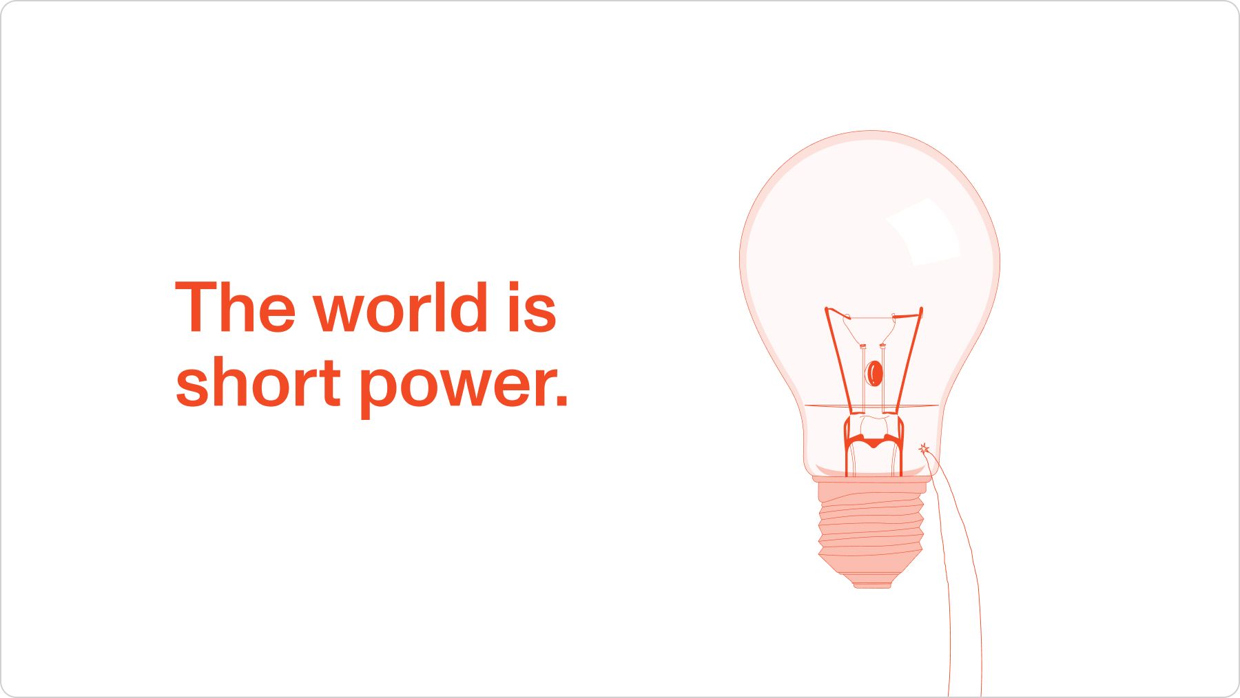
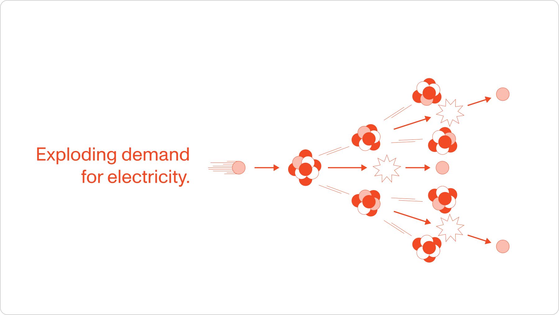
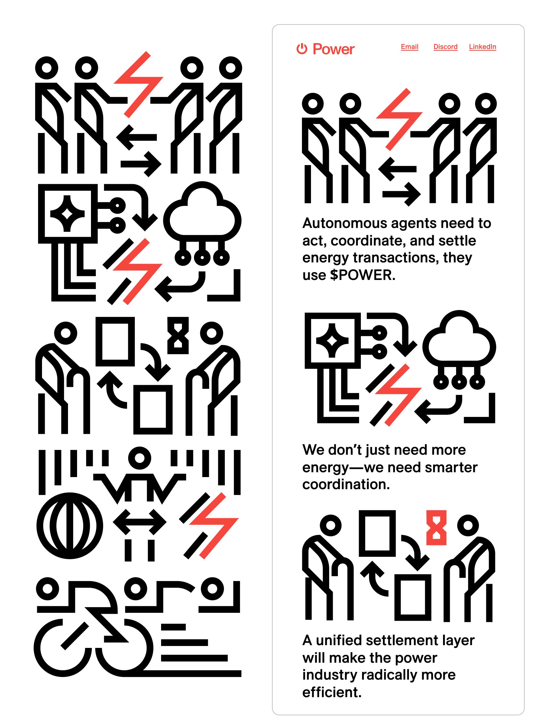
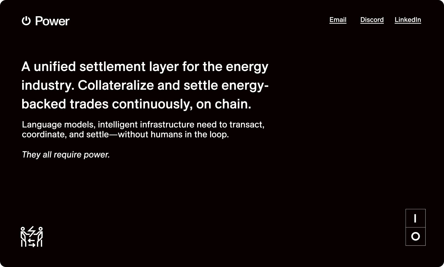
From there, we built the brand story as a marketing site. I further developed the illustration style I introduced when we first discussed the idea of utility: mono-weight abstract illustrations that revolved around energy and the initial story we told.
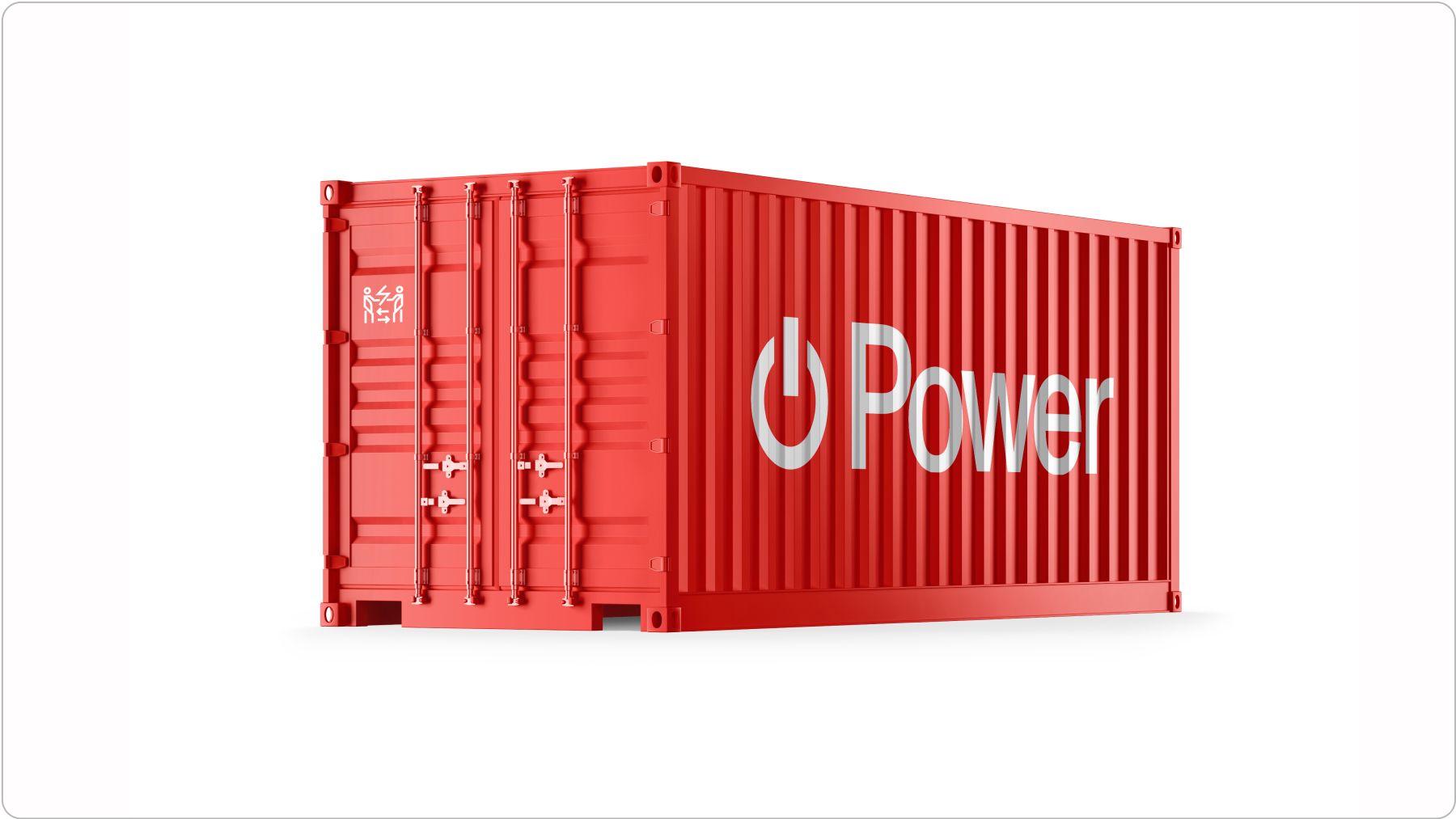
It was time to build out the rest of the brand differently. The shipping container solidified the brand for anyone who was still skeptical; if not, the van definitely did.

To round it out even further, we thought of another neat concept for a marketing site. The idea was that you could flip a switch, much like on a power strip, that would take you to different landing pages for the tokens. Now, the brand was telling a cohesive story in a cohesive style.
We have made changes to our tagging system. The Illustration tag has been replaced with the Art tag, and the UI tag has been updated to UI UX. The Brand and Process tags remain unchanged.