Air Conditioner Window Unit
This bogus interface reflects the upside-down world we live in right now.
Published Jun 26, 2020
Author Steve Berry
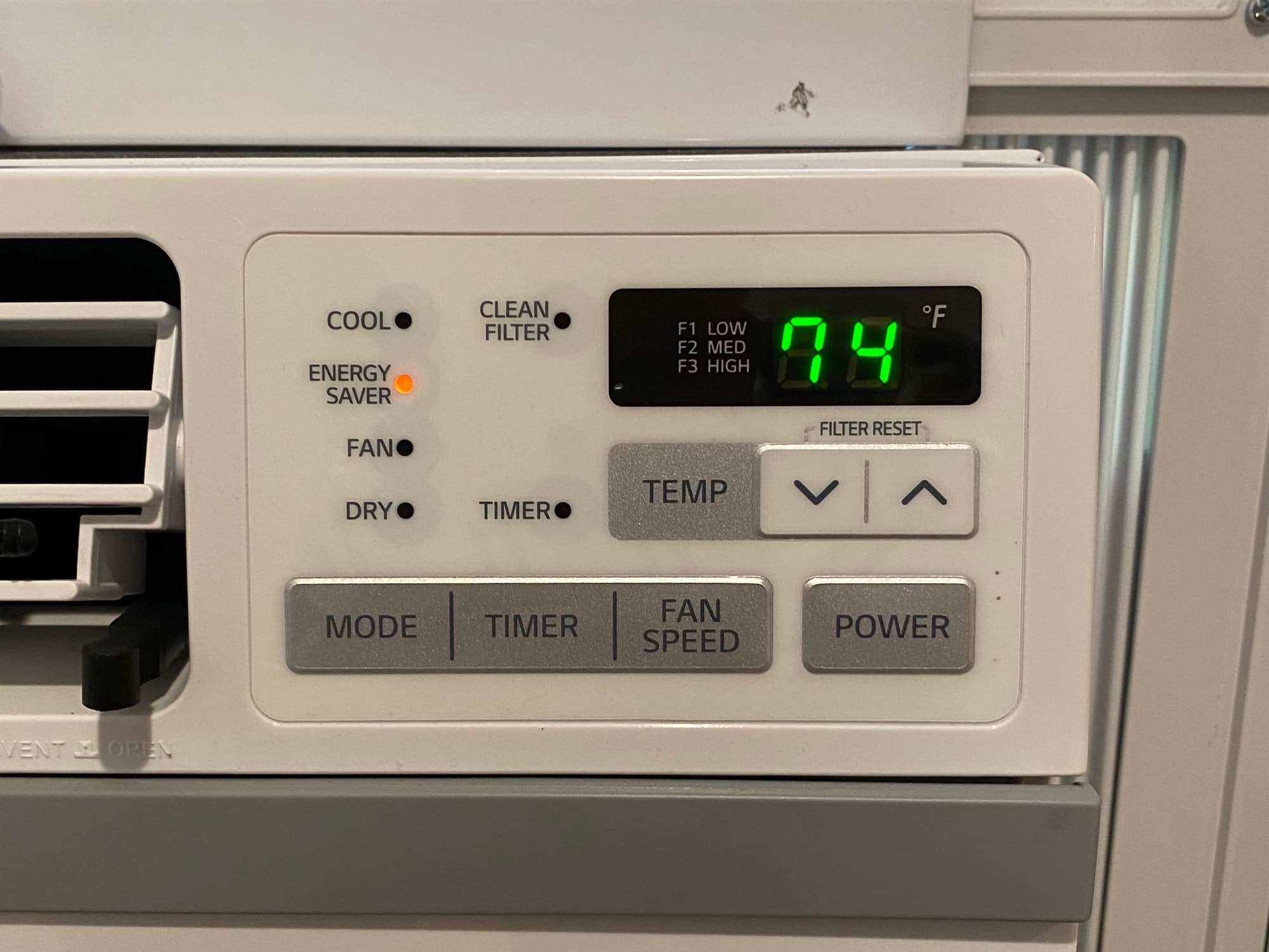
Something bugged me about my office's window AC unit. I could not put my finger on it, although I did at the end of my realization. Every time I went to turn on and adjust my office AC, I made mistakes. I pressed the wrong button; I turned it up when I meant down. Adjusting the air conditioner is a casual affair, so realizing and discovering a tiny nagging problem takes much longer than I'd like to admit.
After a few weeks, I focused in on the interaction mismatch. When I went to adjust the temperature, I frequently would turn the AC up when I intended to turn it down.
My mental model for temperature change (and everything else) is up then down. Not down and up! Whoa! I'd turn on the AC and want to adjust the temperature, usually down - so my finger when for the button closest to the temperature readout, and I went to town. Unfortunately, the left-most button was up. It was a frustrating few weeks until I was able to solve this problem of comfort.
My prevailing mental model was oriented up then down. I needed to survey random people on the internet to see if the "common model" was similar to mine. I asked 100 people on Mechanical Turk, "Select the ordering you believe is correct: up and down or down and up. I asked another hundred people the same question but presented the answer in the inverse order to remove first item bias. Here is a snapshot of the results:

The raw results from Mechanical Turk.
199 people responded with 89% of them identifying up then down as the appropriate ordering of the phrase. The results are statistically significant (99%+)! I'm not crazy, and this AC's UI is poorly designed. Unsatisfactory.