Facebook is whatever you want it to be.
It appears the new boss is the same as the old boss.
Published Dec 19, 2019
Author Steve Berry

The Facebook conglomerate is under growing scrutiny from every dimension. They are the most significant social technology company in the world, with several of the most successful communication brands ever created. Congress is eyeballing anti-trust measures. Their platforms amplify any message that pays them money, defining a new reality for specific audiences around the world. Time to rebrand!

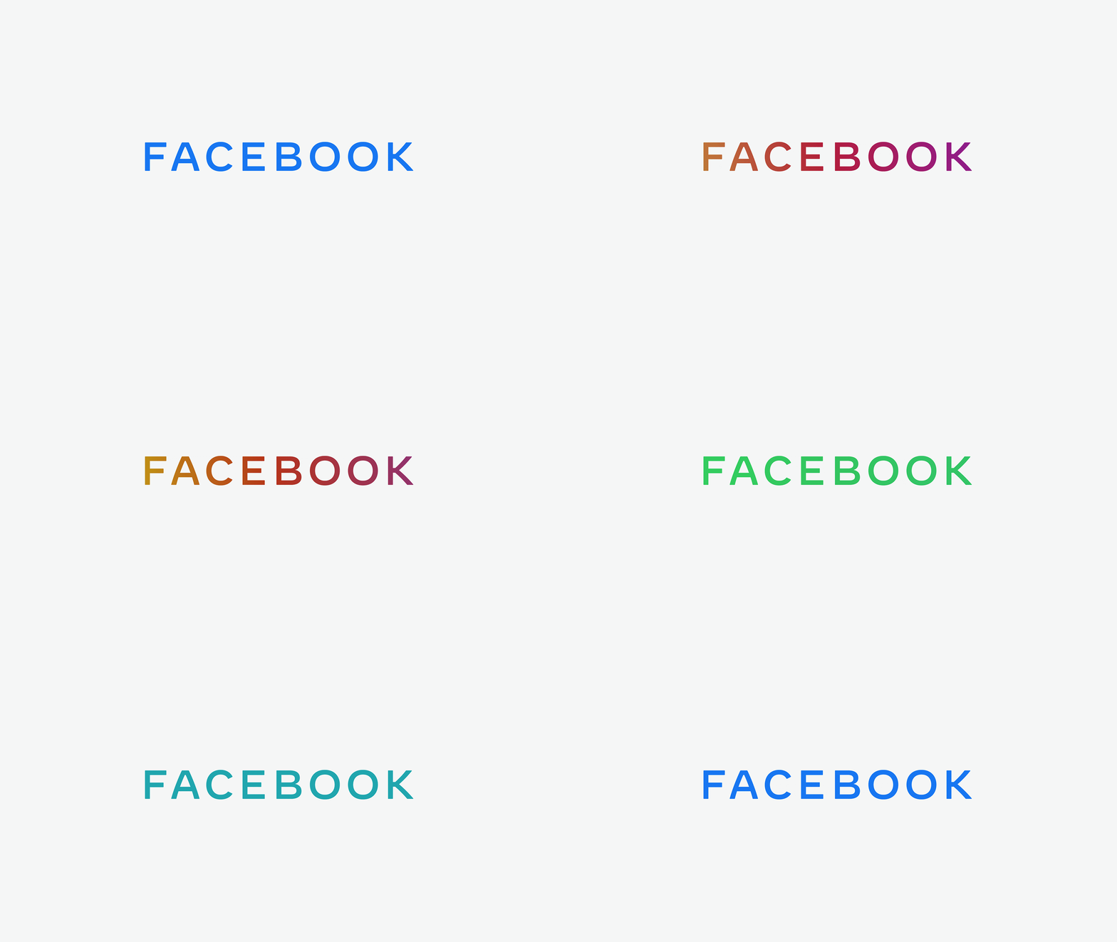
Facebook, the Company (separate from the app), is looking to create visual distance to reflect the diversity of brands that sit inside. The visual execution is nearly flawless. An exceptionally manicured logotype with excruciatingly appropriate multi-cultural brand images. Their wordmark animates well, which is a prerequisite for any modern brand to keep a viewer's attention.
The Facebook Company wordmark goes off the rails when I saw the color-changing "chameleon" animation that displays the logo cycling through a large gradient of color choices. They revealed the true self of their organization, a literal chameleon. We are whatever you want us to be. Terrifyingly obvious.
Tech companies advertised themselves as destroyers of the "old way of doing business." These young, talented, personable founders would rid the world of faceless, impersonal international conglomerates.
It appears the new boss is the same as the old boss.
Images sourced from Facebook.design.


