Color in Application Design
Color moves your eye across the screen. Motion is even more potent.
Published May 26, 2022
Author Steve Berry
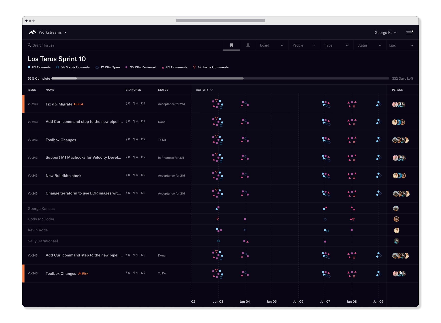
We use color in application design to reduce the cognitive overhead - making the complex approachable and easier to scan.
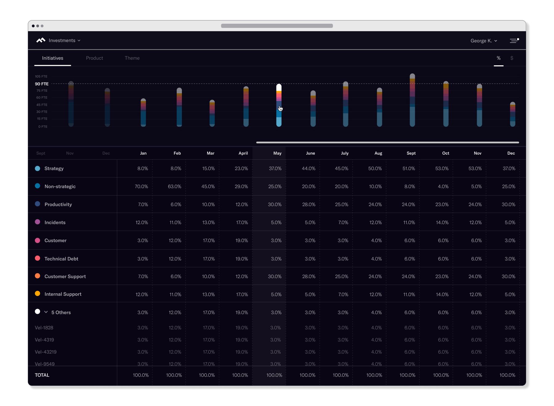
Table design using opacity and color to facilitate faster scanning.

Bar chart builds in with harmonious colors.
A harmonious color family for different categories creates better scan patterns in application design.
Complex workflow analysis visualization.

Building in an animation loop gathers your attention.
Using color to direct gaze and highlight status.
Replace the UI tag with UI UX tag, and replace the Animation tag with Art tag.